MISSION CTRL Goes Live at Wanted Design!
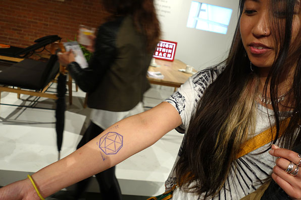
As part of NYCxDesign, the students of the MFA in Products of Design at the School of Visual Arts present MISSION CTRL, a suite of interactions that explore how we come together to experience and share new design. The interventions turn common gestures of digital, social networking into analog artifacts and performances, critiquing our dependence on new technology and providing alternatives for timely communication and wayfinding. Through a playful series of dynamic, participatory installations, MissionCTRL celebrates the design community at large, and invites visitors to put away their devices and interact with each other in real life (IRL). The work comes out of a 10-week class called Design Performance taught by Sinclair Smith, which explores design exhibition beyond the pedestal, focusing in on interaction, participation, and staging new behaviors.
The roving work is part of WantedDesign, and visitors can learn more at ProjectMissionCTRL Tumblr. [Photos: Vidhi Goel]
DSC01428
3X7A4418
3X7A4298_2
3X7A4395
3X7A4295_2
#FAN
As a way to physicalize the "like" button in a new and compelling way, visitors to the exhibition are given a hand-screened, chipboard paddle—called a fan—which takes its cues from the auction world. When visitors see something that they like at Wanted, they “give a wave,” voting with their fan by holding it up alongside the exhibitor—who have been provided with a deluxe model. Together they are able to draw attention to the exhibitor’s work, creating a new gesture of approval and appreciation.
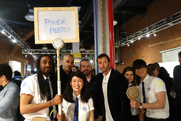
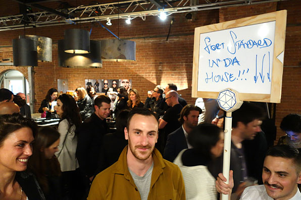
#POST
Here, seven roving vertical signs travel the vast expanse of the exhibition space, allowing visitors to "analog tweet" in real space and in real time. Messages can originate from the Mission CTRL booth, or can spontaneously be created live on the fly. Students work with visitors to help them construct messages, engaging them in conversations around social media and point of view. Analog tweets range from shout-outs of great work, to messages back home, to news of after parties or lost items. #POST provides a large, low-tech, and mobile affordance to help people get their messages seen.
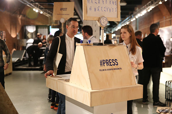
#PRESS
#PRESS creates an analog experience that provides a rich, interactive way to create messages. Posting to social media can be so easy that messages can often be unconsidered and rushed. #PRESS builds in time and labor into the process, painstakingly stamping out messages to be displayed throughout the Wanted exhibit on mobile signs.
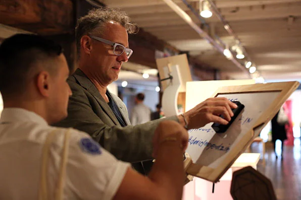
#SNAP
#SNAP is a time-based analog tweet, taking its cues from self-destructing messages like the ones you’d find on services such as SnapChat. Here, visitors write messages on the boards and then hold them up for a limited time. Products of Design students use stopwatches to time the message for 20 seconds, at which point they are lowered and deleted. Here, messages tend to be more personal (and more risky!), where the temporality of the message influences its content.
3X7A4628
#FRIDGE
#FRIDGE is a magnetized letter version of the analog message boards where visitors compose their messages using magnetized alphabets to construct words. Students wear aprons with the sorted letters, inviting interactions between visitors and their ideas.
3X7A4395
#FOLLOW
#FOLLOW is a design intervention that takes its cues from people and ideas that are trending. Here students replace the of gathering followers and retweets in the digital world with actual clusters of human beings—literal “followers”— in the physical world. Students cluster around selected visitors, walk the show with them, and amplify their “likes” by holding up their fans in groups, adding even more attention to the visitor’s message.
#PORTAL
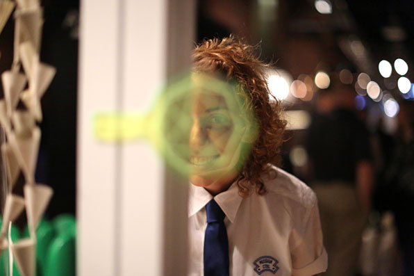
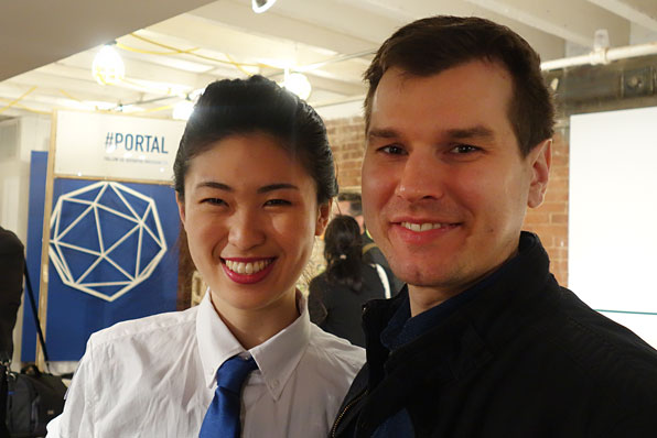
#PORTAL replaces the idea of “checking in” or “logging in” to the digital world. Since people are coming to Wanted Design to have a real life experience, here students create a ceremonial “beginning experience,” initiating them to the show and inviting an opportunity to talk about the mission of MISSION CTRL and the move from the digital to the analog. (Motion sensors in the device trigger an audio surprise audible to the visitor as they pass through the device.)
#DECISIONCTRL
#DECISIONCTRL is an installation to guides visitors through a decision tree, inviting them to evaluate whether or not to tweet something. Students’ insight was that people often regret posting something to their social media—that it’s just too quick and easy—and #DECISION builds in more time to consider whether one should post something or not.
More photos from the show below!


