UNBOUND: Design for Paralysis and Disability
Products of Design MFA graduate Souvik Paul’s thesis, Unbound, seeks to empower individuals with spinal cord injuries and disorders (SCI/D), and to tackle some of shortcomings in treatment paradigms for SCI.
His thesis journey began—violently—two weeks before his arrival at Products of Design in the fall of 2014. While driving her SUV down a California freeway, Souvik’s close friend, Carina, was rear-ended by a tractor-trailer and paralyzed, sustaining a spinal cord injury in the T2/T3 vertebrae. When visiting her in the hospital, Souvik saw how painful her adjustment to life in a wheelchair was. Believing in the power of design to help his friend, Souvik used his thesis as an opportunity to investigate how design could assist people with spinal cord injuries to recapture their sense of agency and identity in the face of such massive physical and emotional trauma.
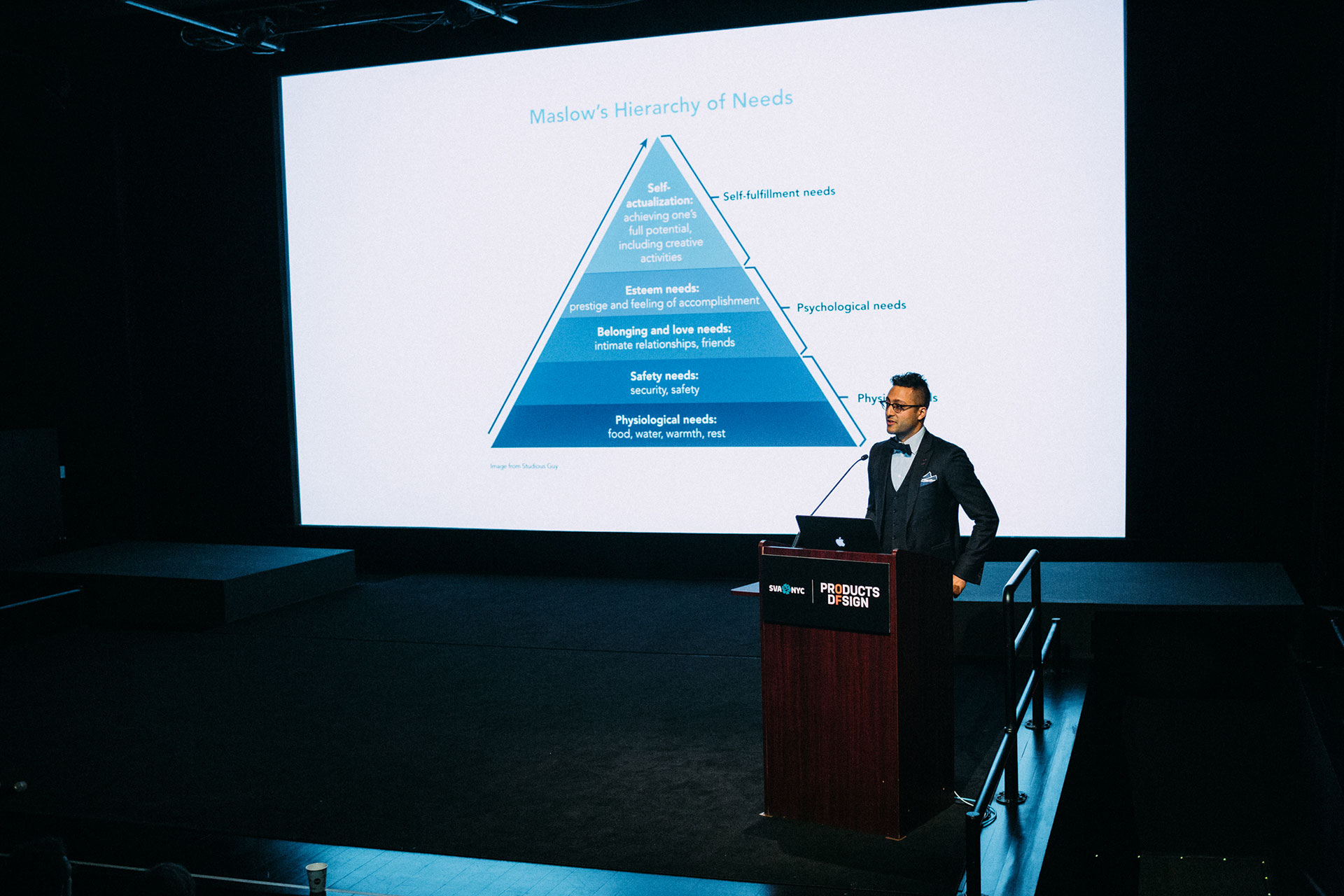
Click to read Part Two of the thesis book on ISSUU here.
As his thesis evolved, Souvik’s approach changed from investigating potential “cures” for spinal cord injuries, to focusing on facilitating adaptation to life with SCI/D.
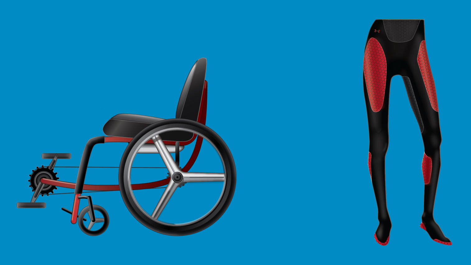
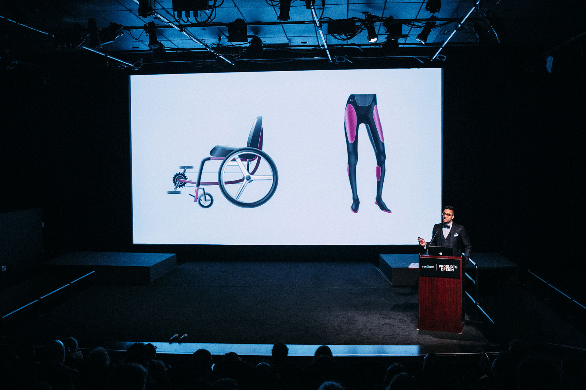
Reflecting on the start of his thesis Souvik recalls, “I initially wanted to design ‘the exoskeleton concept that no one had thought of’ or a wheelchair that used functional electrical stimulation (FES) technology to let users pedal themselves around by stimulating their muscles with electrical currents. In the case of design for SCI/D, I believed that aesthetics was not nearly as important as function. This was soon to change”
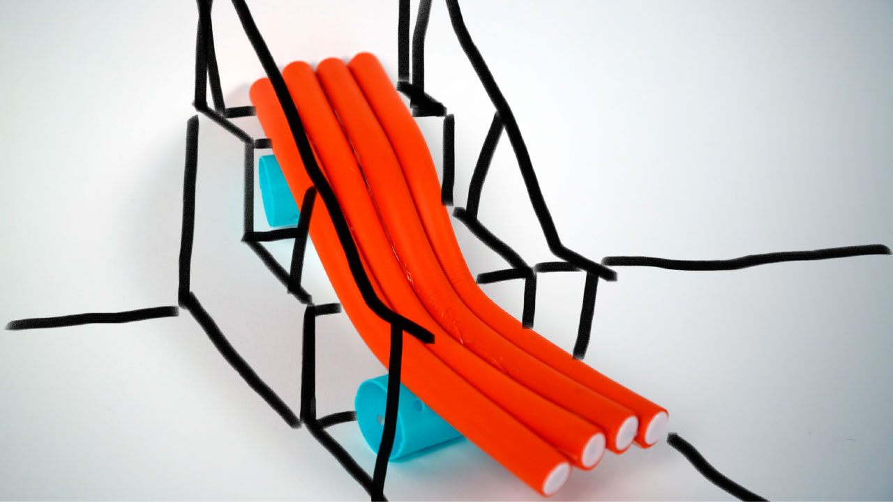
And as his thesis evolved, Souvik’s approach would also change from investigating potential “cures” for spinal cord injuries, to focusing on facilitating adaptation to life with SCI/D. This shift came after after conducting a co-designing workshop with three wheelchair users, who revealed that adaptation was far more important to people who actually lived with disabilities. The outcomes of the workshop included the Zero Step—a modular, flexible, and inexpensive solution to accessibility for small restaurants in crowded cities, and the Store-n-fly—a packing solution for wheelchairs on flights. (Collaborative sketches by participants and designer shown below.)
Souvik also interviewed subject matter experts who shed light on his design approach. “I learned that ‘fresh patients’ with SCI/D do tend to view functional electrical stimulation as the key to their recovery, but that they would do well to focus more on adaptation,” Souvik reflects. “This changed everything. I realized that I was doing exactly the same thing as a designer for SCI/D: Trying to solve instead of respond.”
Souvik spent one week in a wheelchair, navigating the streets of New York City. “I became really angry at myself for assuming knowledge about what it was like to be disabled, and I took this perspective and used it to evaluate the assumptions that I had about the other design outputs of my thesis.”
By setting up ongoing challenges for himself, Souvik was able to further expand his perspective as a designer. Spending one week in a wheelchair—navigating the streets of New York City—was humbling, and revealed his skewed perspective as an able-bodied designer for the disabled population: “My implicit bias that using a wheelchair was merely a matter of will and strength was revealed to me in an extremely challenging way. I became really angry at myself for assuming knowledge about what it was like to be disabled, and I took this perspective and used it to evaluate the assumptions that I had about the other design outputs of my thesis.” In so doing, Souvik felt compelled to redouble his outreach to potential users, and to buttress his perspective with their's whenever possible.
Silent
Interviewing several individuals with SCI/D, Souvik was desperate to develop a deeper empathy. He asked the taboo question: “What does paralysis feel like?” And despite fearing that the inquiry might only distance himself from his users, the risk was worth it. Hearing their stories, and their descriptions of sensation, provoked a visceral sense of empathy in Souvik, and led to a work of experience design experience called Silent.
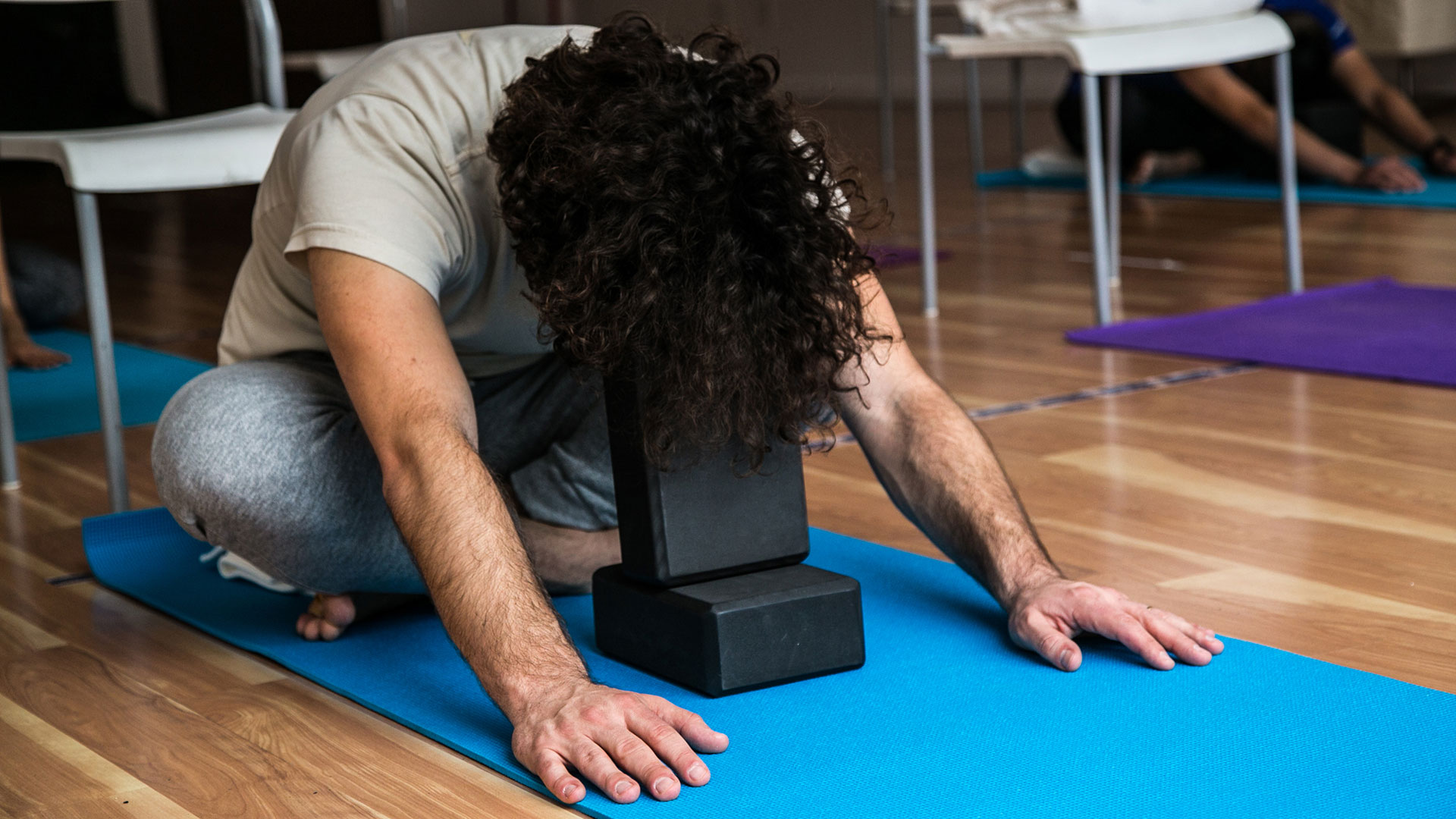
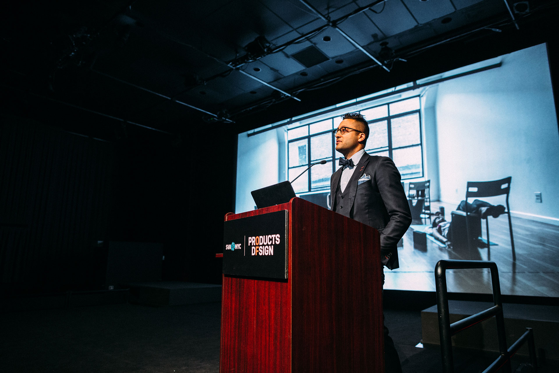
Silent is a multimedia, restorative yoga session. Partnering with yoga instructor Rebecca Ketchum to develop the event, Souvik collected audio recordings from five different people—three of whom described their sensations of SCI/D. The structure of the event borrowed concepts from Matthew Sanford’s autobiography, Waking: A Memoir of Trauma and Transcendence, about paralysis and yoga. In it, Matthew frames silences and healing stories as essential for the healing of the body and the creation of the mind-body connection. He writes, “Silence is the word I use to describe the empty presence we experience within our experience—between our thoughts, between each other, between ourselves and the world. It is the feeling of emptiness and fullness at the same time. Healing Story is a term for the stories we have come to believe that shape how we think about the world, ourselves, and our place in it.”
In Souvik's experience design, spoken-word recordings of people’s reflections on their bodies were played in between yoga poses, heightening the mindfulness of all participants and fostering a deeper mind-body connection. (The emphasis of restorative yoga is on the development of the mind-body connection through the thoughtful contemplation of the body in stillness and in silence, and is of benefit to both abled and disabled people.)
The sequence of poses that participants completed were the result of a dialogue between Souvik and Rebecca, and were designed to mimic the sensations described in the audio clips. The pacing and the sequence of the yoga class included silences to go along with the healing stories in the recordings—giving participants time for the personal contemplation that was necessary after hearing the stories around someone else’s body.
At the close of the event, one participant noted that he "entered a liminal space between consciousness and sleep during the session," and from within this space, it was difficult for him to "differentiate between his own thoughts and the recordings that he heard during the yoga session.” As a result, he felt as though the stories that he was hearing were his own—which dramatically increased both the empathy that he felt for the author of those stories, along with his awareness of his own body.
Science backs up the experience that participants felt during the event Mirror neurons—nerve cells that fire in the brain when a person observes or listens to an action that they aren’t actually doing—serve a kind of biological empathy. Recent studies indicate that mirror neurons respond to sound, and that they are but the “best understood example of a wider class of vicarious neural responses encompassing the domains of actions, sensations, and emotions." [LINK]
Silent was a design about paralysis, rather than a design for paralysis. Souvik decided his next thesis work would focus on three key moments in the lives of patients with spinal cord injury: Rehabilitation in the hospital; Leaving the hospital; and Adjusting to everyday life with spinal cord injury.
Rehabilitation in the Hospital: Journey
Journey is an app that connects recently-injured spinal cord patients to one another based on their personality type and injury type. The motivation for this app came from the belief that sometimes the best support can come from someone who is going through a similar experience, and an insight from a registered nurse who noted that nights are particularly hard on patients “because there is so much time to just sit and think.” In these moments, Souvik argues, “words just aren’t enough to comfort and support someone who has undergone trauma.” So he wanted to develop a nonverbal communication tool for people with SCI/D and their support network—precisely for those moments.
The idea for Journey had evolved over two semesters. Initially, it paired a patient with a team of people including spinal cord injury veterans who have been out of the hospital for years (and therefore have a lot of advice and perspective to offer the recently-injured patient), as well as the patient’s occupational therapist. The app relied primarily on a chat interface to connect users—where in addition to conversing with one another, they could post videos related to their recovery. Methods of input included a text keyboard and voice-to-text interface.
But as Souvik continued working on the app, he became more interested in the idea of an app that responds to emotion. After researching the psychological connection between color and mood, he developed a UI schema where the colors yellow and green—often associated with happiness and stability, respectively—became the predominant colors of the UI when the user was “sad.” Red and orange—colors that often signify energy and playfulness—dominate the UI when the user is “energetic and happy,” leveraging the positive mood and translating it into movement and action. Blue—thought to evoke feelings of serenity and trust—is used in the UI when the user’s mood is “neutral,” serving as a transitional color when the UI changes in response to the user’s mood.
The control of the UI incorporates a conversation user interface (CUI): The user repeats a recovery mantra in order to open the app, and software gauges the user’s emotional state through pitch, amplitude, and cadence. In addition to responding to the user's mood, the app's UI can change if members of the user's team—the occupational therapist, along with the SCI veteran and the user's partner —"ping" the user. This ping is accompanied by an audible note, which is different for each member of the team. If all members of the team ping a user at the same time, the tones mingle in a complementary fashion, creating a musical chord whose key changes according to the user's mood. Visually, the ping blossoms on the user's screen, emanating from the icon of the pinging user. The colors of the ping emerge gently, and accelerate if more members of the team ping the user. The purpose of the ping—non-verbal and unwritten—is to provide support in the moments when words are not enough.
The patient noted that “the loaner chair that a patient leaves a hospital with,” and “their first custom wheelchair” are the two worst wheelchairs that they will ever use.
Leaving the Hospital: Test Drive
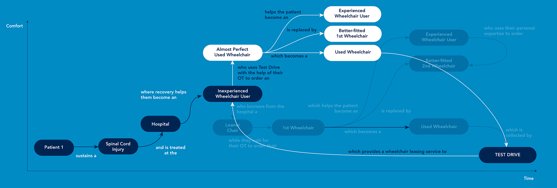
The insight for Test Drive emerge from an early user interview with a SCI/D patient. The patient noted that “the loaner chair that a patient leaves a hospital with,” and “their first custom wheelchair” are the two worst wheelchairs that they will ever use. Because the loaner chair from the hospital is generic and ill-fitting, the patient invariably orders a custom wheelchair with the help of their occupational therapist—but without the benefit of yet knowing their idiosyncratic uses and needs. As a result, this first wheelchair is often ill-suited for the patient, and can even be dangerous. For Souvik’s user, this meant that she was prone to falling and hitting her head on the floor, because her chair’s center of balance was too far back. This is particularly heart-breaking, since these kinds of frustrating and dispiriting experiences are often the first that people with SCI/D have with the outside world after a lengthy hospital stay—underscoring just how much has changed since they’ve acquired their disability.
But what if instead of borrowing the loaner chair from the hospital, the patient could be fitted for a used wheelchair—bought or leased from an SCI/D veteran—that is nearer to an ideal fit? Here, the new user could spend more time in that chair, developing their wheelchair handling skills much faster. Down the line, they’d know more precisely what kind of a wheelchair is best suited to their idiosyncratic needs. This would present a significant improvement over the current system, where patients often end up with a poorly-fitting wheelchair that they are stuck with for the next five years because of insurance costs.
After conducting market research and looking at how used wheelchairs are currently sold, Souvik realized that there were a few key components that were necessary to making sure that Test Drive was a credible service: The service needs to have the buy-in and approval of the medical community; a quality verification protocol for the goods being sold; and precise sizing information in both the seller-side and buyer-side portals. After mocking up a website for Test Drive, Souvik reframed the service as a marketplace—where buyers can connect to sellers, and vice versa—thereby reducing the costs associated with shipping wheelchairs and warehousing them. (Eventually, this marketplace could expand to reselling of any durable and expensive medical equipment that could be used by multiple owners. The name Test Drive would still be fitting.)
Living with SCI/D: CleanCath
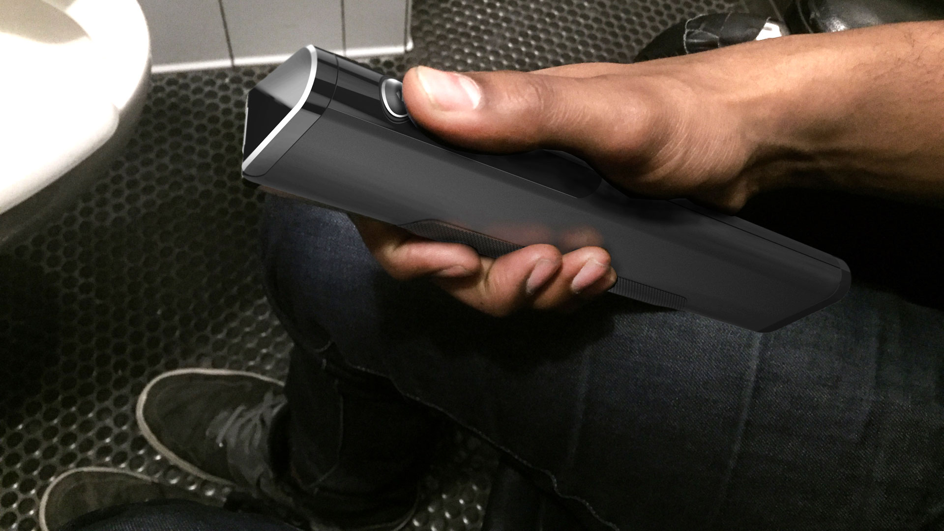
CleanCath is a device that uses UV-C radiation to kill bacteria on silicone intermittent catheters. The device originated from early thesis work on incontinence and bowel management. “Having to relearn urination and defecation” was one of the hardest things to adjust to after sustaining a SCI/D, according to users. This is particularly urgent from a design perspective, since the topic of elimination is not openly discussed, and there can be a lot of shame initially associated with it. Indeed, urination and defecation are two of the first things that individuals learn in their development as human beings—even before forming memories
Souvik learned from one of his subject matter experts that she reuses single-use catheters for her urination regimen—though this absolutely "not a doctor-recommended activity" because of the potential for urinary tract infection (UTIs). And because her insurance pays out once a month, she has to predict ahead of time how much she would urinate the next month—an impossible task that forced her to stockpile catheters and then to reuse them. (Many users who engage in reuse store the catheters in Tupperware containers.)
Since her insurance pays out once a month, she has to predict ahead of time how much she would urinate the next month—an impossible task that forced her to stockpile catheters and then reuse them.
Souvik explored various methods of sterilizing catheters—from rinsing with hot water and rubbing alcohol, to using dry heat, to using UV-C radiation. The last method was most effective, and is the central technology for the CleanCath device which incorporates a UV-C fluorescent bulb at its center. CleanCath allows users to quickly and effectively sterilize their catheters, should they find themselves forced to reuse them.
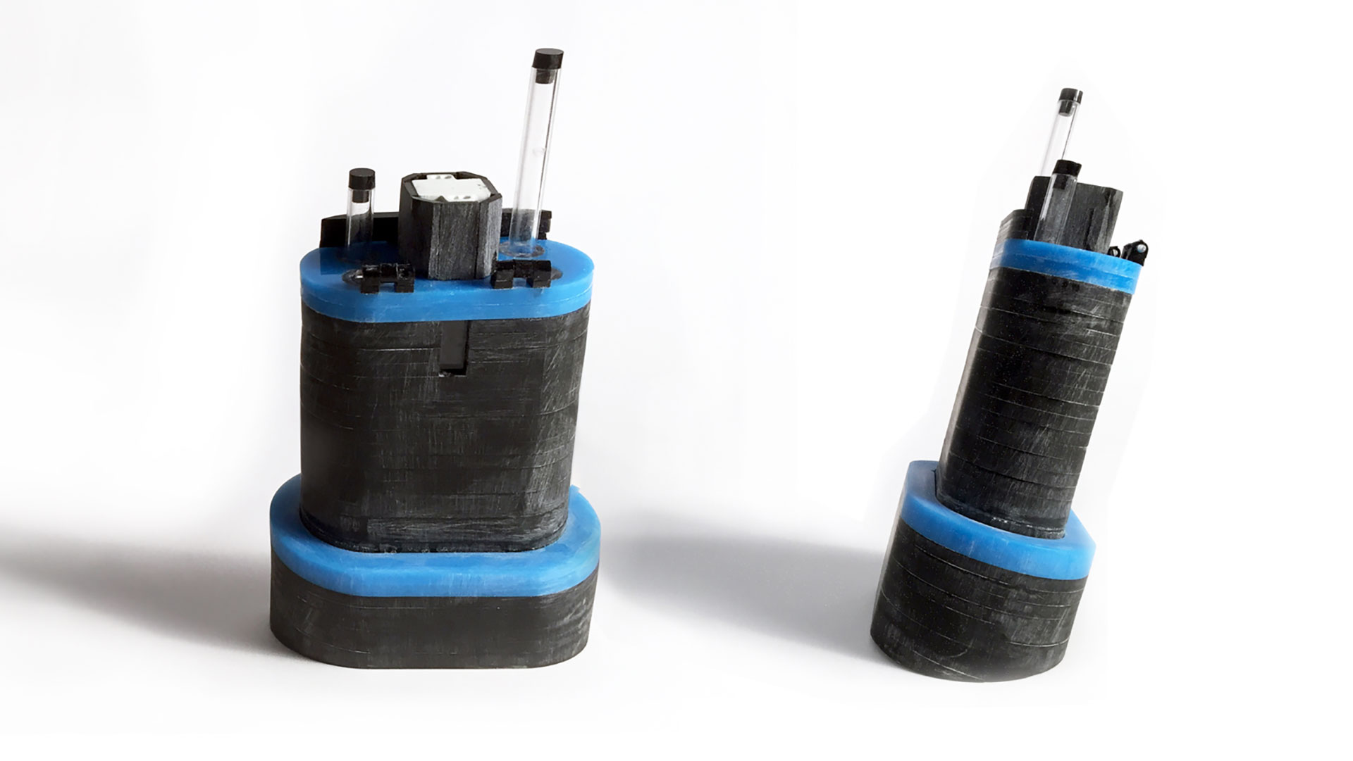
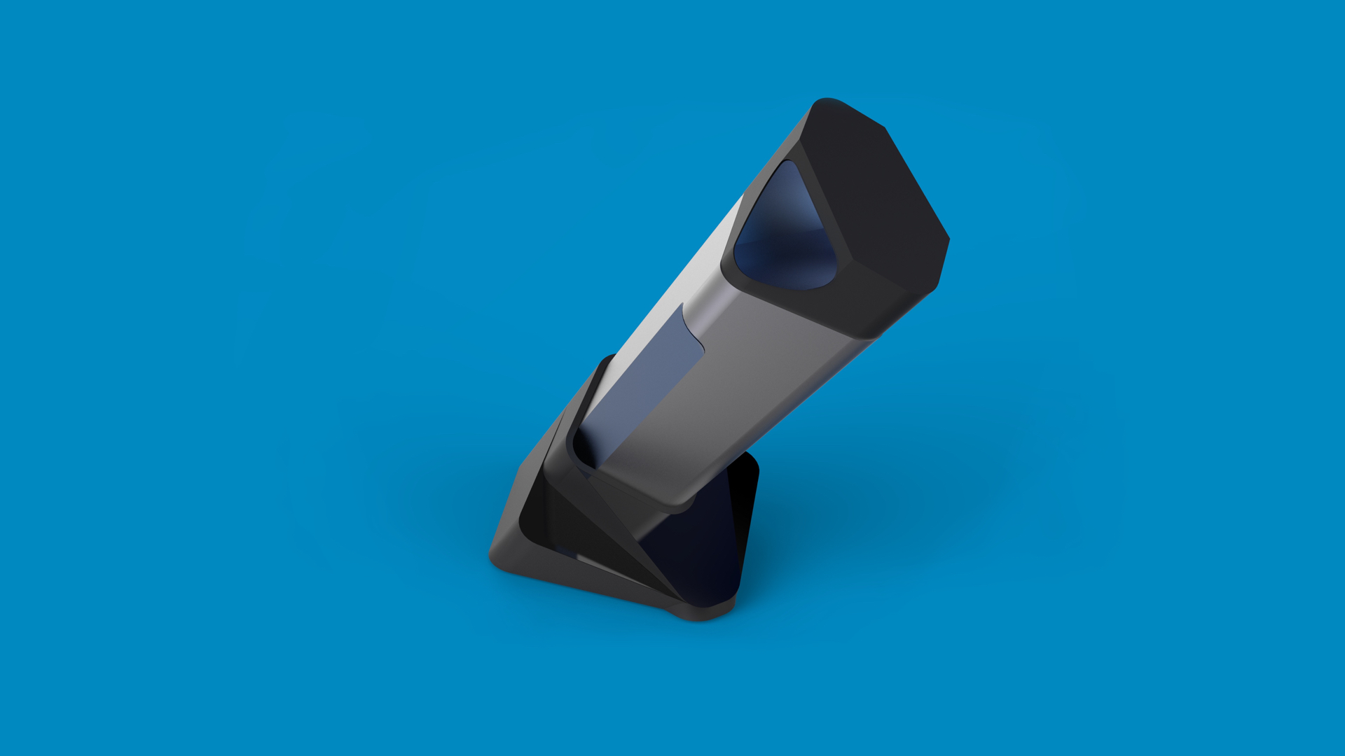
Here’s how CleanCath works: First, users rinse out their used catheters with warm water, and then place them into the device. Closing the lid automatically initiates the cleaning cycle, turning on the UV-C bulb which irradiates the catheters and renders them sterile. Early iterations of the product design featured a detachable oblong cylindrical container—equipped with a quartz glass interior that slid over the bulb and attaching to the base of the sterilizer at an angle. A silicone base provided impact absorption, and the angled design was chosen so that a wheelchair user could examine and manipulate the contents of the CleanCath comfortably from a seated position. The device was designed to fit and sterilize multiple catheters at once, but allowed for a single catheter to be removed with minimal risk of contaminating the others. Finally, the design provided for easy transport for travel.
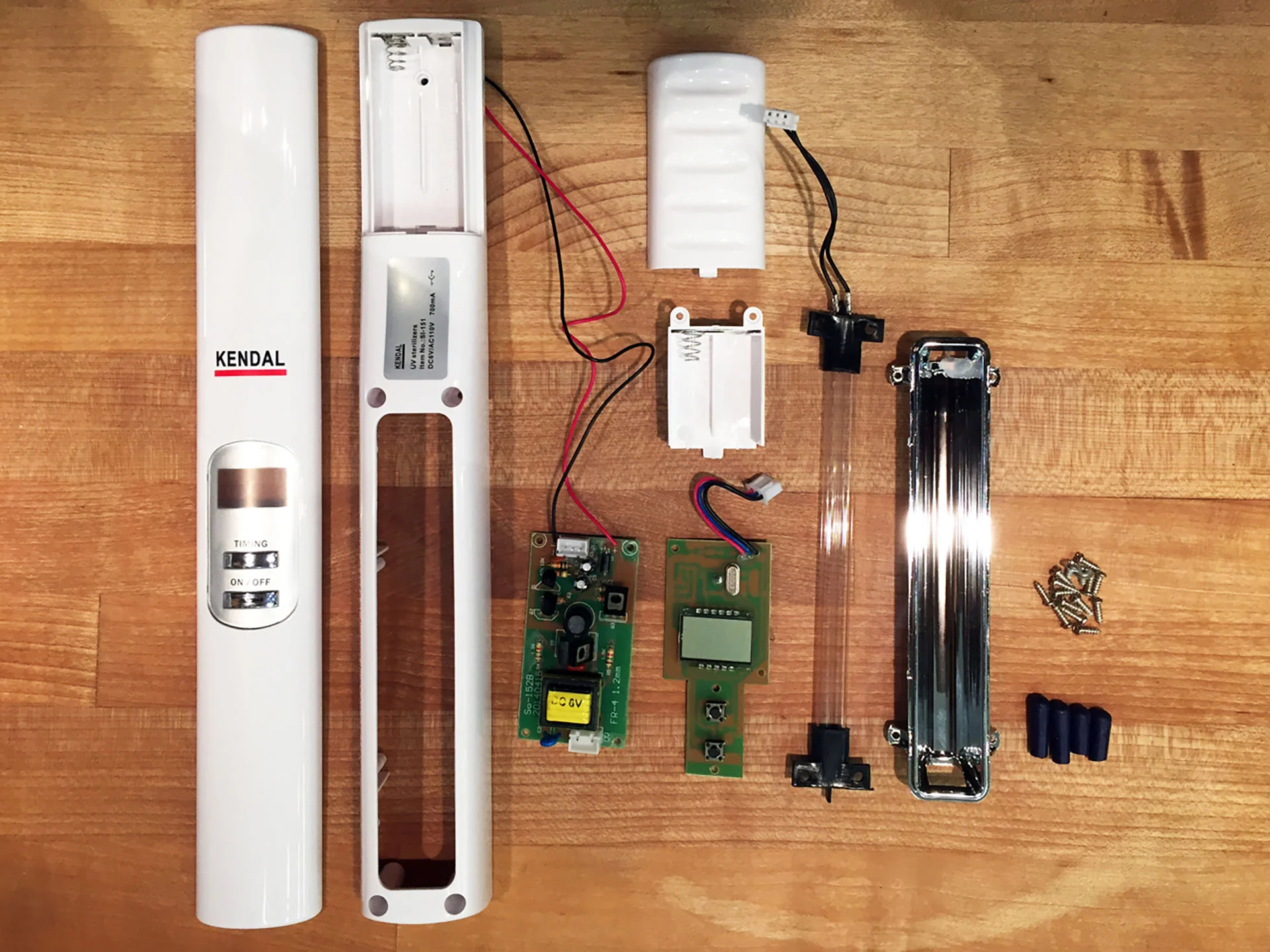
Souvik deconstructed existing UV-C products, pulling apart their componentry in order to better engineer a functional and feasible device. Revising the design for the CleanCath, he put the UV-C bulb into a separable body of the device—powered via an onboard rechargeable battery and increasing its portability—and then turned the base into an inductive charging stand. Finally, the internal chamber was split into two halves—allowing users to store their used-but-rinsed catheters in one half, and their unused, sterile catheters in the other. Even if the battery lost its charge, sterility would still be maintained.
“Why couldn’t my user be proud of a product they depended on several times a day. People are proud to pull out their gorgeous new phone. Why couldn’t this device to be that beautiful?”
From “Medical Device” to “Consumer Product”
The initial iterations of the CleanCath’s design borrowed heavily from the aesthetics of existing medical devices; at the time, it seemed natural to use the familiar formal and graphic vernacular of medical products—“antiseptic plastic” with blue graphics and highlights.
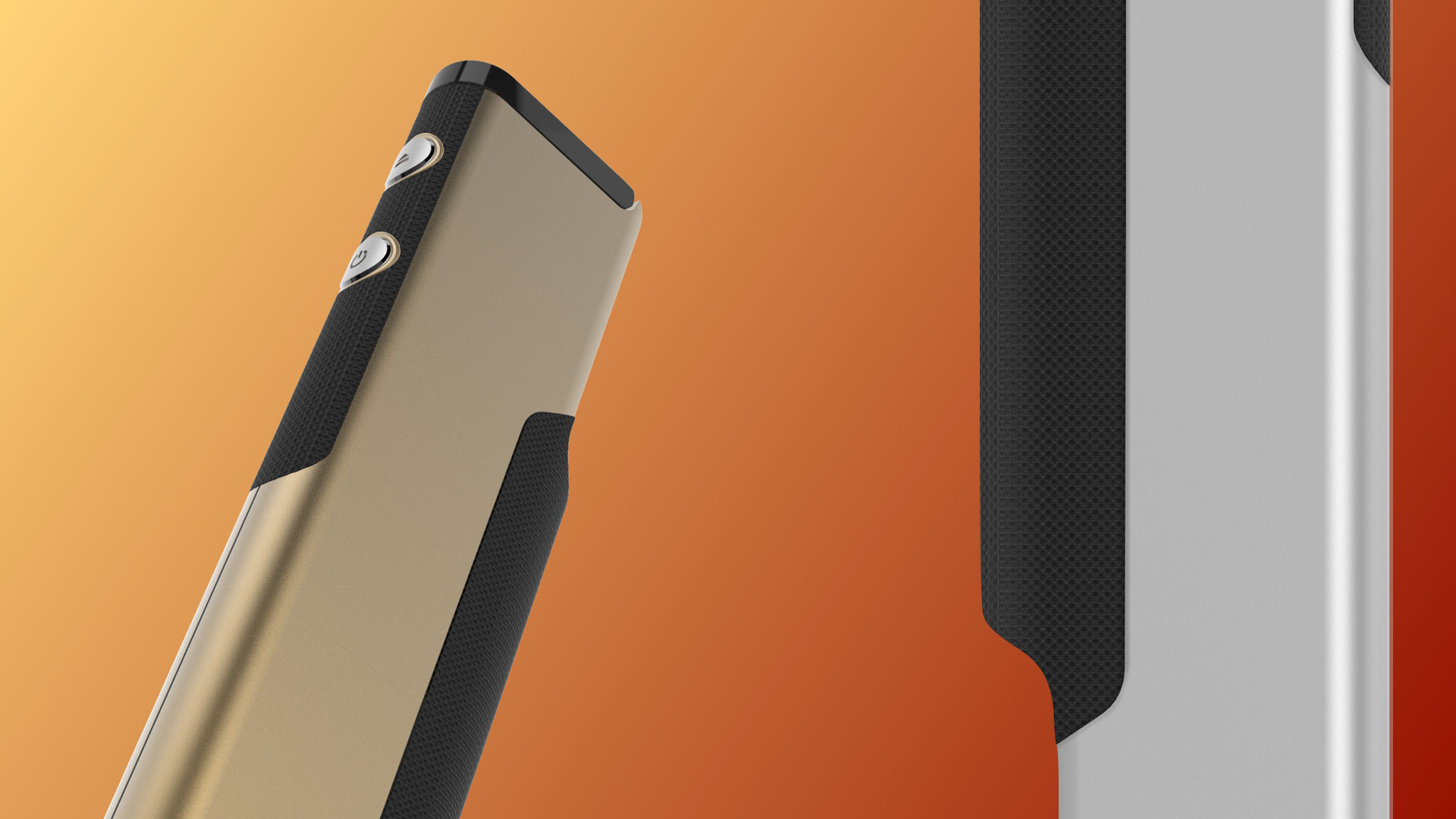
But nearing the completion of the project, Souvik wanted to move away from a providing a medicalized device. Instead, he wanted to create a humanized product. He asked, “why couldn’t my user be proud of a product that they depended on several times a day. People are proud to pull out their gorgeous new phone. Why couldn’t this device to be that beautiful?”
So he explored materials not typically used for medical devices in an attempt to make the product more naturally fitting into the objects that his users might already carry—mobile phones, Bluetooth speakers, quantified-self bracelets, and the like. “I wanted to make this product—this constant touchpoint of disability—something that could provide just a tiny bit of joy. Just a tiny bit of beauty,” Souvik argued. “The product should be discreet and safe, certainly, but could it be something that an onlooker might see and respond, 'hey, what is that? That looks pretty cool!' Can you imagine that scenario?"
He concluded that "aesthetics and form can be just as functional as product features, especially for individuals looking to regain their sense of identity in the face of a life-altering accident."
Moving forward, Souvik is also looking that the possibility of returning to the "hacker ethos" that his original users employ in sterilizing their own catheters—developing a 3D-printable version of the CleanCath that could be hacked together with the "guts" of a consumer UV sterilizer. Stay tuned!
Souvik began his thesis as a designer who was enamored of function and features, tending to discount the importance of aesthetics and form as mere window-dressing. He learned that aesthetics and form can be just as functional as product features, especially for individuals looking to regain their sense of identity in the face of a life-altering accident.
Learn more about Souvik Paul’s work at souvikpaul.com, and contact him at spaul4[at]sva[dot]edu


