MASTERS THESIS: Grey Space, by Lance Green
Lance Green’s master’s thesis, Grey Space, focuses on the spaces in which urbanites often find themselves—working between the home and the office. The project’s design offerings encourage user adaptation within these spaces by removing feelings of displacement and helping to adjust to new or unfamiliar working environments. Grey Space is an exploration into the places that encourage us to be most at peace within ourselves and within the world around us; the spaces that allow us to rebalance and make sense of a disorder, to inspire us, and perhaps to provoke new thought.
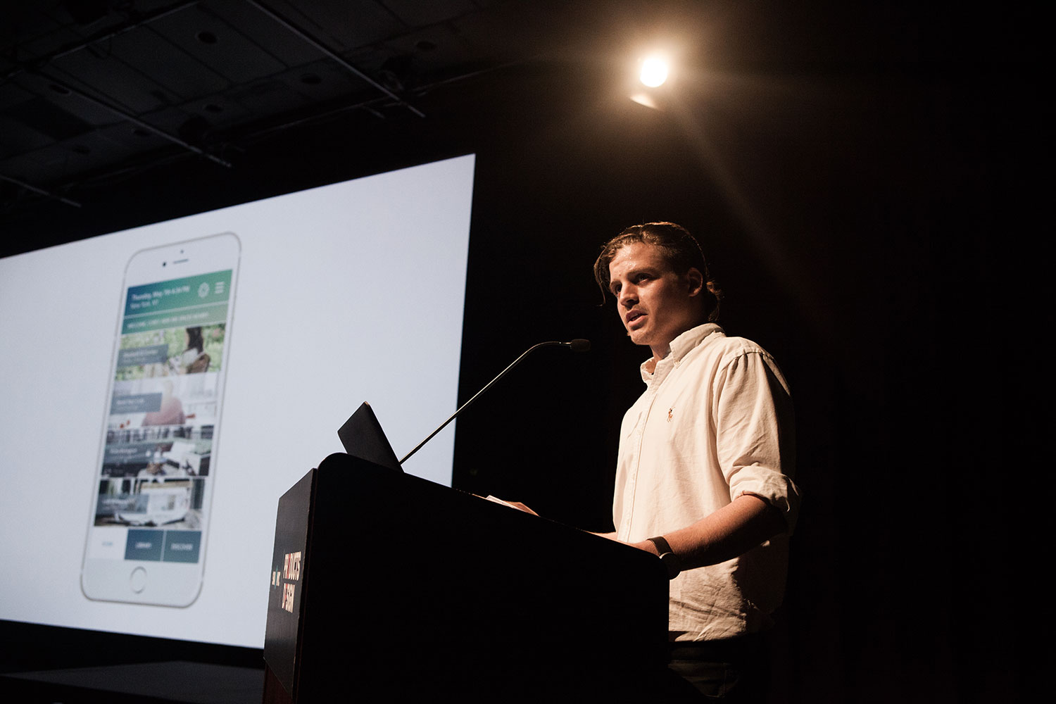

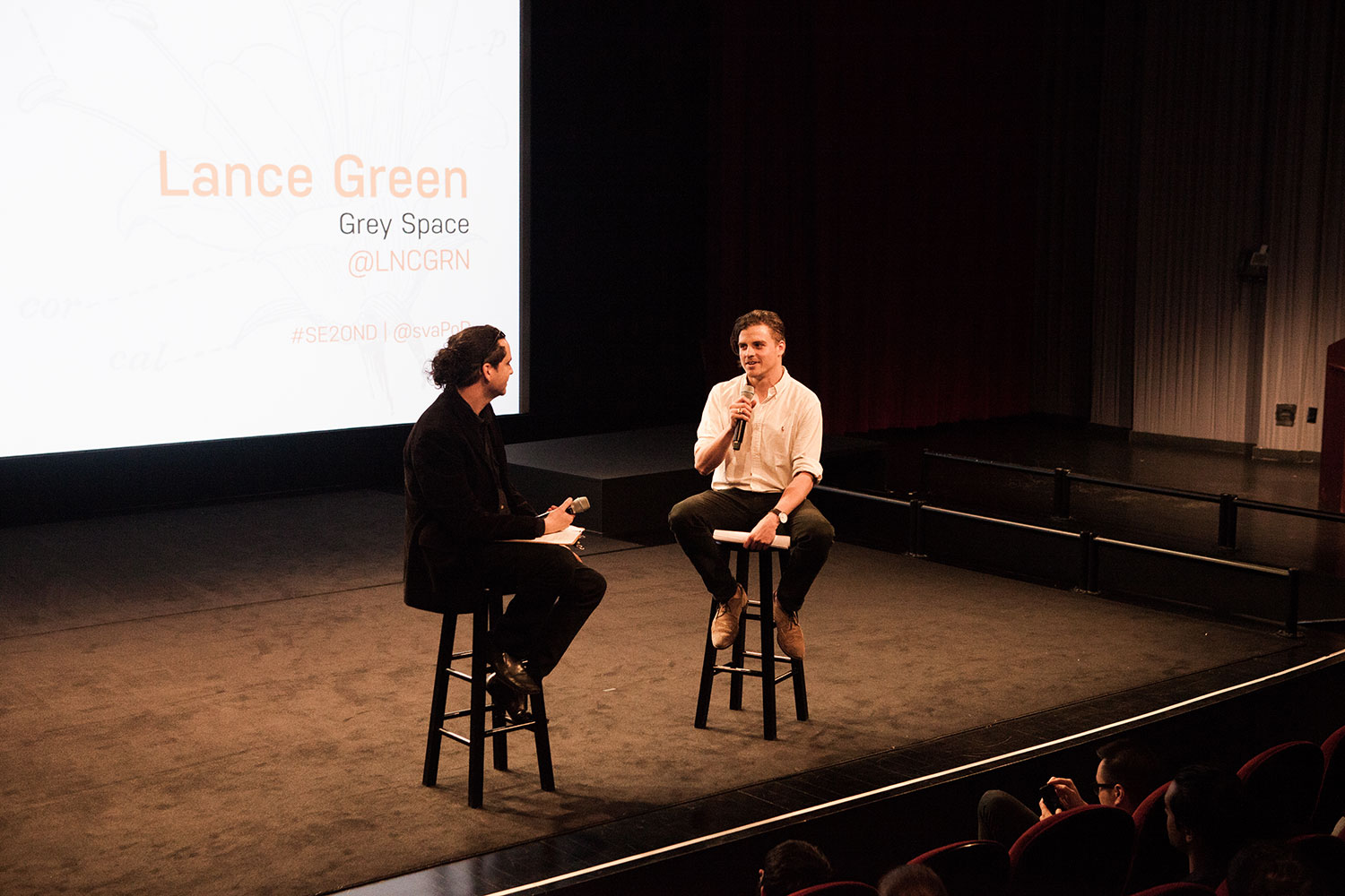
Lance Green's master's thesis, Grey Space, is a study focused on the interstitial spaces in which we often find ourselves working, and on our ability to adapt to new or unfamiliar working environments.
Whether it is the structure and prescribed nature of the open-space office, the comfort and careful curation of our own home, or our ability to adapt to makeshift, public workspaces, Grey Space explores these interstitial territories in search of an understanding of where we work best, and why.
Explored through a variety of design lenses and research methodologies, user and expert interviews, and business explorations, Grey Space concentrates on the creative workspaces. Whether it is the structure and prescribed nature of the open-space office, the comfort and careful curation of our own home, or our ability to adapt to makeshift, public workspaces, Grey Space explores these interstitial territories in search of an understanding of where we work best, and why.
Initial Designs
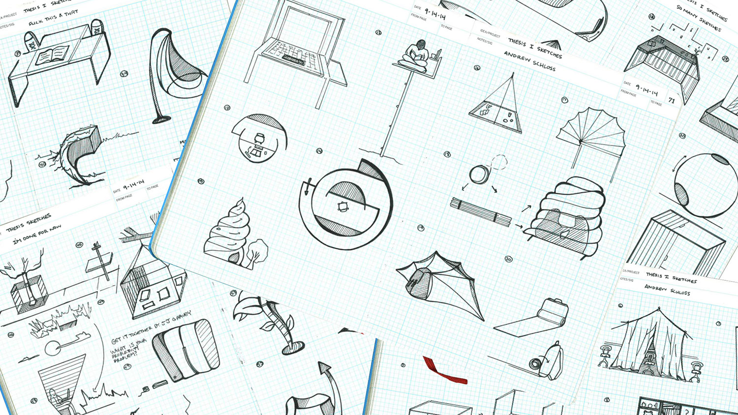
Concentrating on unwanted distractions within a space, Lance created myriad sketches ranging from indoor and outdoor workspaces, designs for private offices and co-working spaces, the mobile office, and reimaginings of the modern cubicle.
Early prototypes included an indoor and outdoor workspace built on a rotating axis for open-air working conditions, or the independent desk with a vertically-adjustable enclosure to allows for alternating levels of privacy between users and their surrounding spaces. These spaces, though provocative in terms of an individual’s own privacy, were found to exist in extreme cases of isolation within urban environments—spaces that are often non-existent within these regions. “It was a different kind of privacy that Grey Space was in search of,” Lance argued. “The private side of public architecture.”
The Freelance Chair
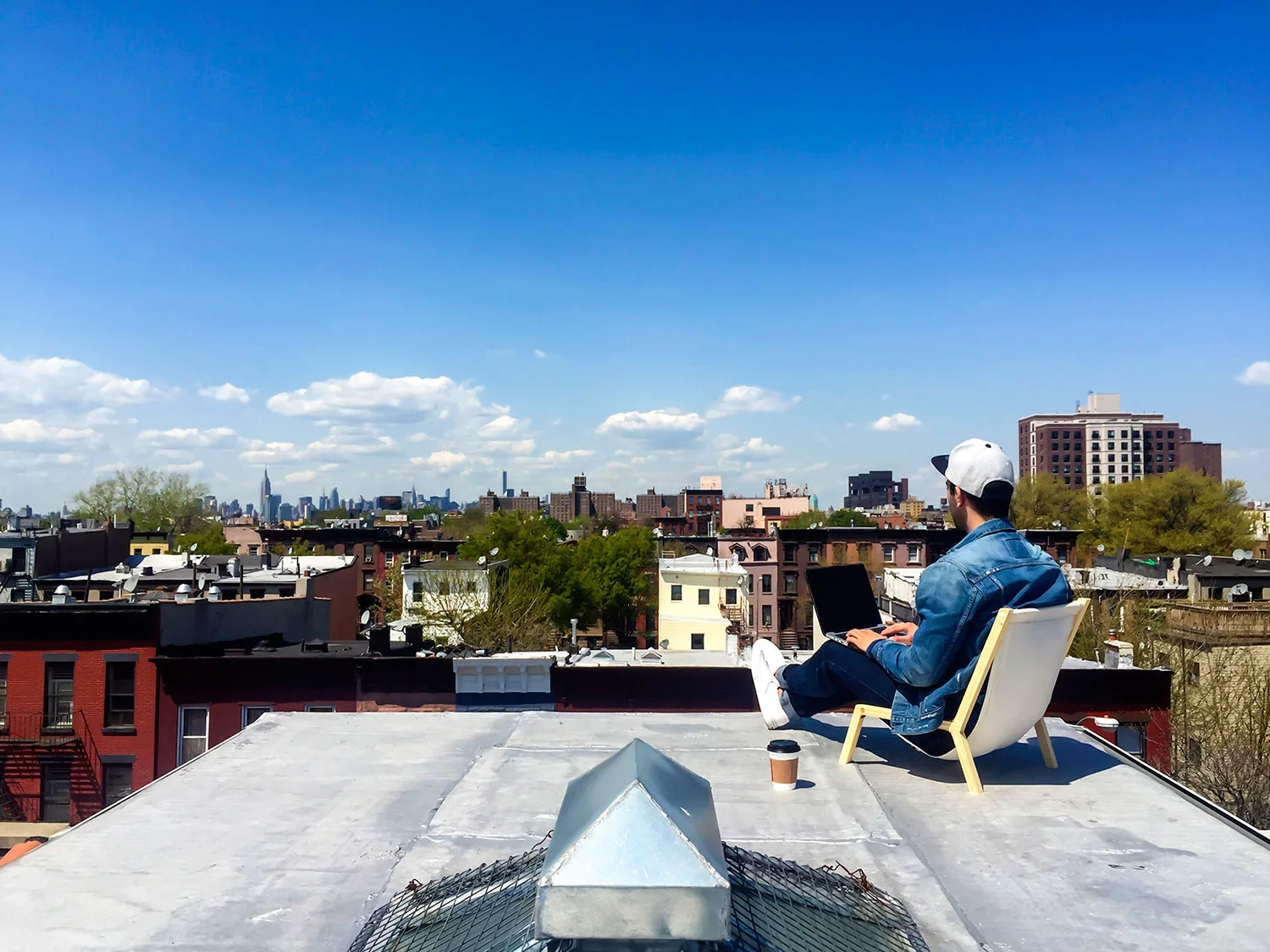
The design of the Freelance Chair was inspired by the mobility of the freelancer, navigating the environments we often discover between the home and the office: parks, rooftops, or even sidewalks. The Freelance chair was designed to free the freelancer, transforming potential Grey Spaces into makeshift workspaces. Laptops fit comfortably within its collapsible, hinged structure, and together are easily portable to newly-discovered locations.
Smells affect our mood and behavior, which, in turn, are able to affect our work performance.
Design for Sensory Stimulation
Further design offerings focused on the human senses as a means of creating more immediate influencers within Grey Spaces. As an interior spaces are largely composed of the lighting, sound, scent, material textures and objects that are present, Lance sought to leverage their sensorial potential. The design for sensory stimulation featured a series of interventions tested in interstitial workspaces, using both physical and psychological features to promote creative thinking and positive energy. Here, the aim was to stimulate a healthier and more enjoyable working environment.
Design for Smell
Smell was the first sense to be explored—specifically our relationship to the smells that have been shown to influence a person’s ability to be happy. Indigenous medicinal practices have long harnessed the power of plants for medicinal purposes, and many believe that there are mental and physical remedies to common ailments such as stress and mental fatigue through the burning of incense, drinking teas, or inhaling aromatherapeutic scents and essential oils.
Designed for an on-the-go worker, Scense Pods are small, scent-capturing containers with perforated holes and self-locking lids to hold and transport scents for personal use throughout the day. It was possible to identify specific, pleasurable scents that influence how we think and act—which, in turn, produce positive moods that have been shown to influence ability.
Design for Light
Lighting has been shown to influence productivity and attention in both the work and education environments. Reducing lighting in specific ways can result in a more “personal atmosphere,” and have the power to designate private spaces within public environments. Conversely, as lighting becomes brighter, the more public, or open, the space can seem. Colors, when introduced into lighting, have a variety of effects on the human body. Some researchers have found that blue can encourage focus and is energizing; the body responds with positive thoughts to the warmth of the color yellow; certain hues of pink and green can be used to relieve anxiety and stress; and red can cause excitement and alertness.
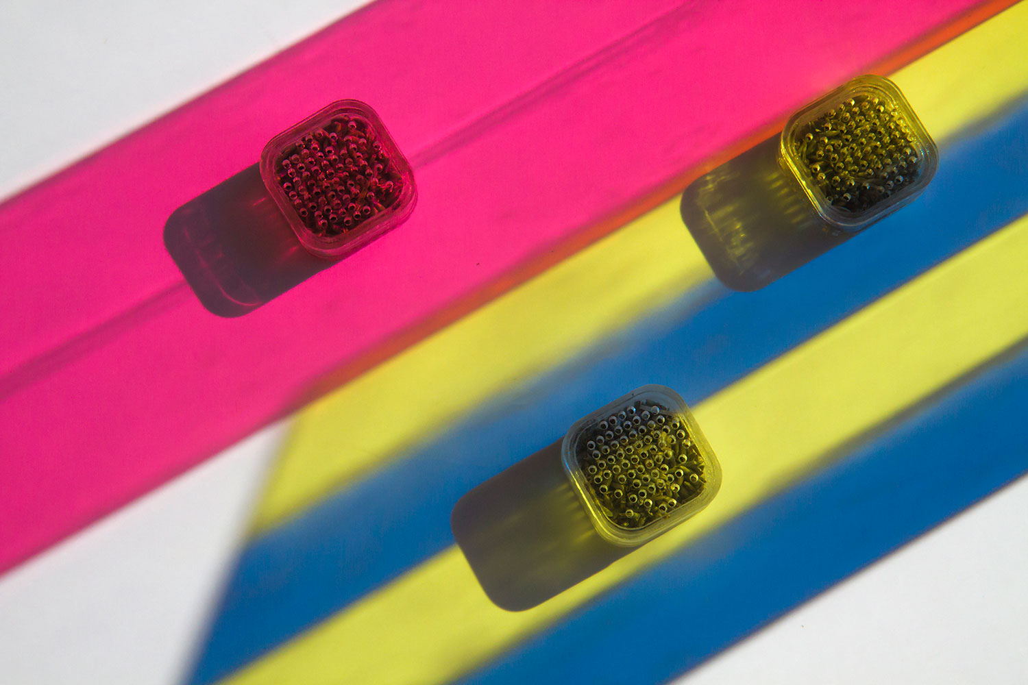
Spectrum is a lighting element designed to be “a kind of desktop therapist,” harnessing the power of natural sunlight and allowing users to create their own unique sources of inspiration and happiness through processes of chromotherapy. The design for Spectrum features a bi-fold, clear acrylic platform with slots for Spectrum ColorBars on each end. Users can select from a range of angles to position the platform upon their desk; the hinge allows for adjustments of forty-five degree intervals. With the platform in place, the user is able to create their own Spectrum of colors based on their desired effect. The inside edge of the platform is inscribed with each color available to use with the product, as well as a brief summary of the benefits and effects of that color.
For instance, if a person desires increased performance and productivity along with a calm and warming presence, they might choose for half of the ColorBars to be in the cooler, blue spectrum, and the other half to be in the warmer, pink spectrum. “The modularity of the system allows users to cast expanding spectrums of color across their workspaces,” Lance submits. “The beams not only can lay claim to their personal territories, but also provide workers with a playful and inspiring push to get them through their day.”
Press Release: The Branding of Legalized Marijuana
With regard to the psychological sides of Grey Space, Lance saw an opportunity in the recent legalization of marijuana across numerous states within the U.S., and in a speculative partnership with New York State Senator Liz Krueger, created a cohesive brand identity for legalized, over-the-counter medicinal marijuana. Harnessing the health benefits of legalized marijuana and leveraging the power of branding, the goal was to take something viewed by a large majority of the public as negative, and reframing it in a way that promotes its benefits and educates its users.
Sensation, a Multi-Modal Sensory Deprivation Experiment
A further exploration into the effects of the senses upon the mind, Sensation is a multi-modal, sensory deprivation experiment that Lance conducted in the Bedford Stuyvesant neighborhood of Brooklyn, New York.
Within a prescribed atmosphere, visitors were asked to engage with the left portion of their brain within a state of mental flow—a combination of blind contour drawing and sensory exploration achieved using a process known as the Ganzfeld Effect. (This experiment was discovered through the research of psychologist Wolfgang Metzer in the 1930s, and is a form of perceptual deprivation caused by exposure to an unstructured, uniform field of sensory stimulation.) Effects of such deprivation included the brain’s ability to search for missing visual contexts; multiple senses such as the sense of touch, hearing, and smell become amplified.
Participants were asked to create visual representations of their personal experience, using “Spectrum Tools” of oversized crayons on a 25’ x 10’ paper roll, lit from multiple directions with red, blue and yellow lighting. Within these color combinations, participants were asked “to locate the most suitable field of light and illustrate their unique feeling of creative flow.” Participants were thrilled with the experience, offering that it was a truly unique way to perceive visual stimuli and respond back.
Grey Space: The Mobile Application
As the U.S. workforce becomes increasingly mobile, millions of Americans are already participating in multiple forms of telecommuting; people whose work is done outside of the typical office setting. Telecommuting also refers to the work done outside of a 40-hour week already spent in the office—checking email, returning calls and reporting remotely...usually in the evenings and on the weekends. These workers are often called “independent contractors” or “moonlighters”, and they frequently find themselves working without a dedicated workspace. Here, the Grey Space mobile app helps users locate Grey Spaces nearby.
The Grey Space app is a matchmaking service that connects users to a carefully-architected network of makeshift and public workspaces nearby. Lance argues that everyone works differently, and that they often experience a feeling of displacement when adapting to a workspace outside of the office. Rather than providing results based on what people desire within a space, however, the mobile application allows users to locate workspaces based on what they don’t want. Here, spaces are analyzed in terms of distractions found in the lighting, sound, scent, material and objects present as a way to help inspire workers by prevent unwanted interactions.
After downloading the Grey Space application, locations are presented based on their availability and ‘distraction’ criteria. For prime members, Grey Space acts as the mediary, collecting perishable inventory from local cooperatives and unused workspaces, and selling them to freelancers at a discount of the price of a membership or temporary pass. Partnerships with local businesses, gardens, private plazas and rooftops give prime members exclusive access to new locations, choosing from top workspace environments in their area. In addition, the Grey Space application encourages users to discover their own public workspaces by identifying the positive qualities of a space and getting rid of the negatives. The application allows users to capture a location, recording specific aspects of the space that were helpful to them for future reference.
In the example above, the application identifies the Elizabeth Street Garden in the Nolita district of Manhattan as a desirable Grey Space. Upon selection, users are presented with a brief: “One of few publicly accessible green space in Manhattan, this area features bench seating, soothing sounds, sun and shade amongst the flora and fauna.” Further inquiry into the space loads a more detailed assessment, including availability of natural lighting, lack of wireless internet, along with recent user-generated photography.
Analogous to the repetitive stress disorders found with the introduction of the first computer mouse and keyboards, Lance posited that the long-term effects that the constrictions and tightening of the hands would have on our limbs would introduce a new form of rheumatoid arthritis—“osteoculus”.
The Virtual Creative Office in the Year 2030
As a final exercise, Lance explored a speculative future of work “that is almost entirely stripped of the human senses.” This is a world where the virtual office has been widely adopted, and designers are able to create in an alternate and virtual reality. This is a space existing between the home and the office—a territory that involves both physical and digital tools.
Here, Grey Space as a virtual platform questions a not-too-distant future in which our bodies will be stressed in new ways through the frequent use of gestural interfaces and rapid body movements. Analogous to the repetitive stress disorders found with the introduction of the first computer mouse and keyboards, Lance posited that the long-term effects such constrictions and tightening of the hands would have on our limbs would introduce a new form of rheumatoid arthritis.
In this future, “osteoculus” becomes another classification under a growing list of chronic inflammatory disorders; it’s a form of arthritis that has emerged due to the over-usage of the gestural interfaces used in virtual reality environments. The disease commonly occurs in the arms and hands where flexible tissues at the ends of bones wear down. The design of the apparatus features a body harness,attached to the rear waist of the user and extending upwards over the shoulders. This keeps the hands weightless and extended out in front of the body.
“The popular, ‘Hollywood’ portrayal of futuristic interface technologies is typically sexy-and-flawless,” writes Lance. “The design for a body harness illustrates stands as a critical commentary and push back.”
Learn more about Lance Green at LNCGRN.com, and contact him at lgreen1[at]sva[dot]edu.

