Overwhelmed: Work, Play, Time, and Design
Karan Mahendra Bansal’s thesis, Overwhelmed: Work, Play, Time, and Design, investigates Time Poverty in the context of knowledge workers. Defined as the state or condition in which an individual lacks the discretionary time required for activities to build their social and human capital, Karan asserts that the underlying reason for Time Poverty is not the lack of time, but the lack of choice. Roughly 80% of American knowledge workers feel that they never have enough time to do the things they want to, and collectively fail to utilize approximately 700 million vacation days each year. Startled by the magnitude of this fact, Karan began to explore our complicated relationship with time.
Roughly 80% of American knowledge workers feel that they never have enough time to do the things they want to, and collectively fail to utilize approximately 700 million vacation days each year.
The clock, which Karan calls “a designed object of power,” is used to standardize and influence how we choose what to do. Choice is not only a matter of the individual, but is also responsive to environmental factors that include a web of ecological forces—social, economic, political, and media-related—that co-create how we interface with choices in life. By understanding this, Karan’s research and products of design explore how individuals can be more intentional when deciding how to spend time within their digital lives, work lives, and personal lives.
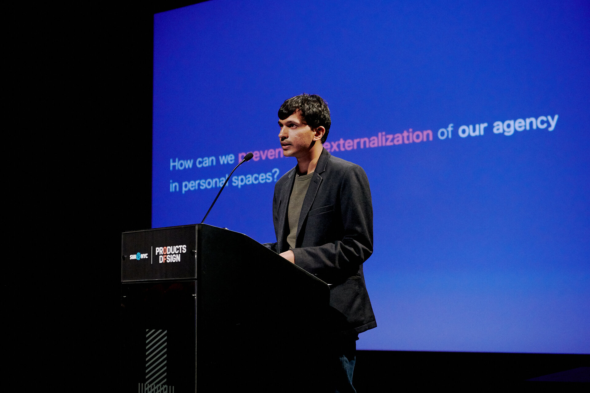
Karan’s suite of products range from speculative designs that explore how we can showcase the difference between clock-time and time as we experience it; to platforms that give us control over the constant digital interruptions into our non-digital lives; to physical products that visually aid us in managing our choices; to services that subvert existing encroachments on choice and create cultures of play, allowing us to manifest pure forms of unmediated individual choice.
Timescape
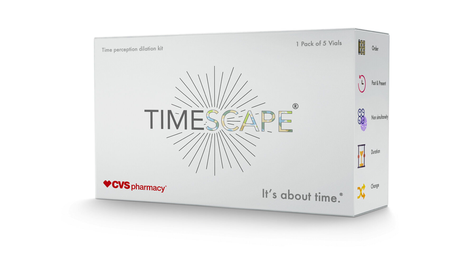
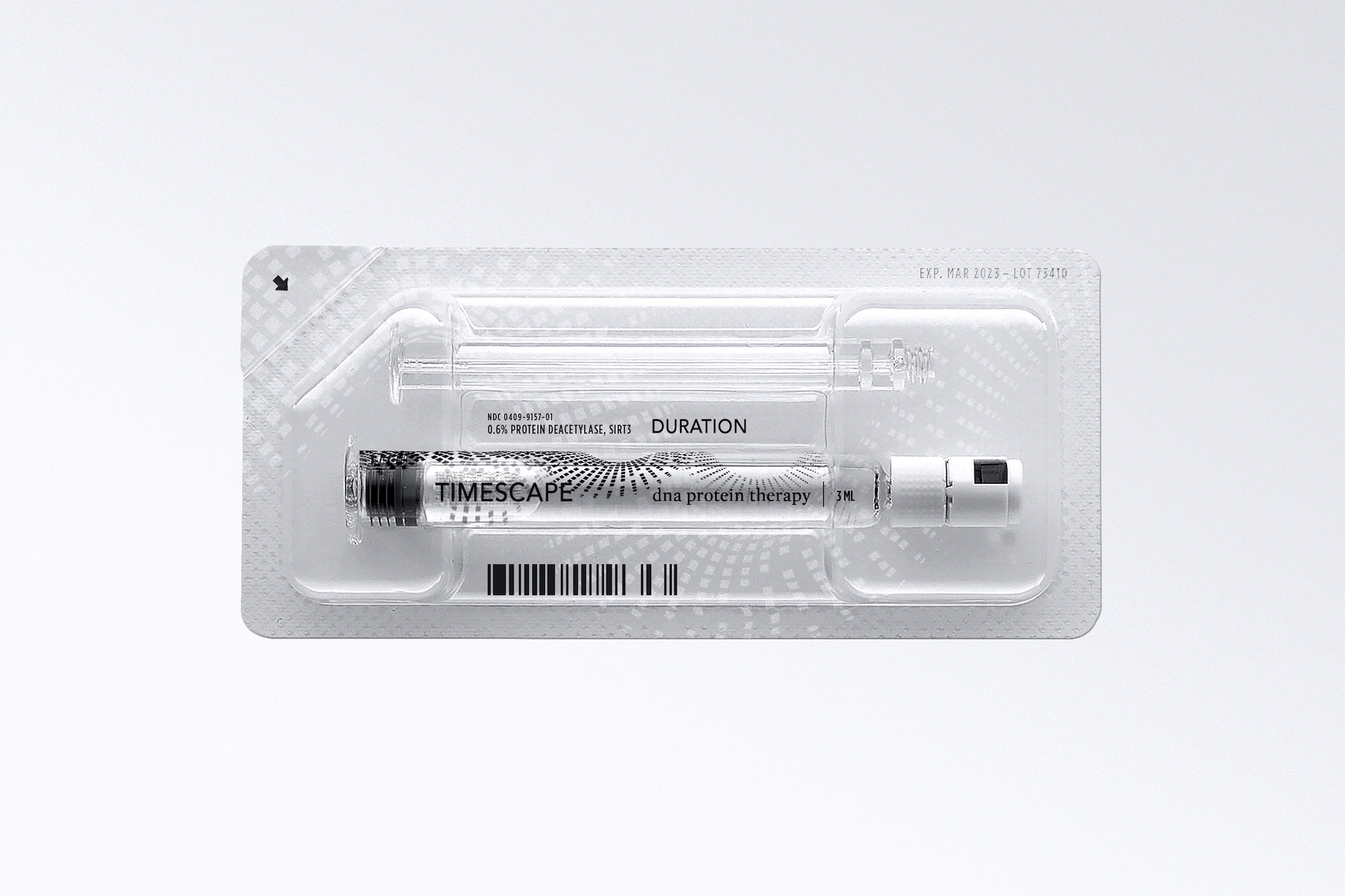
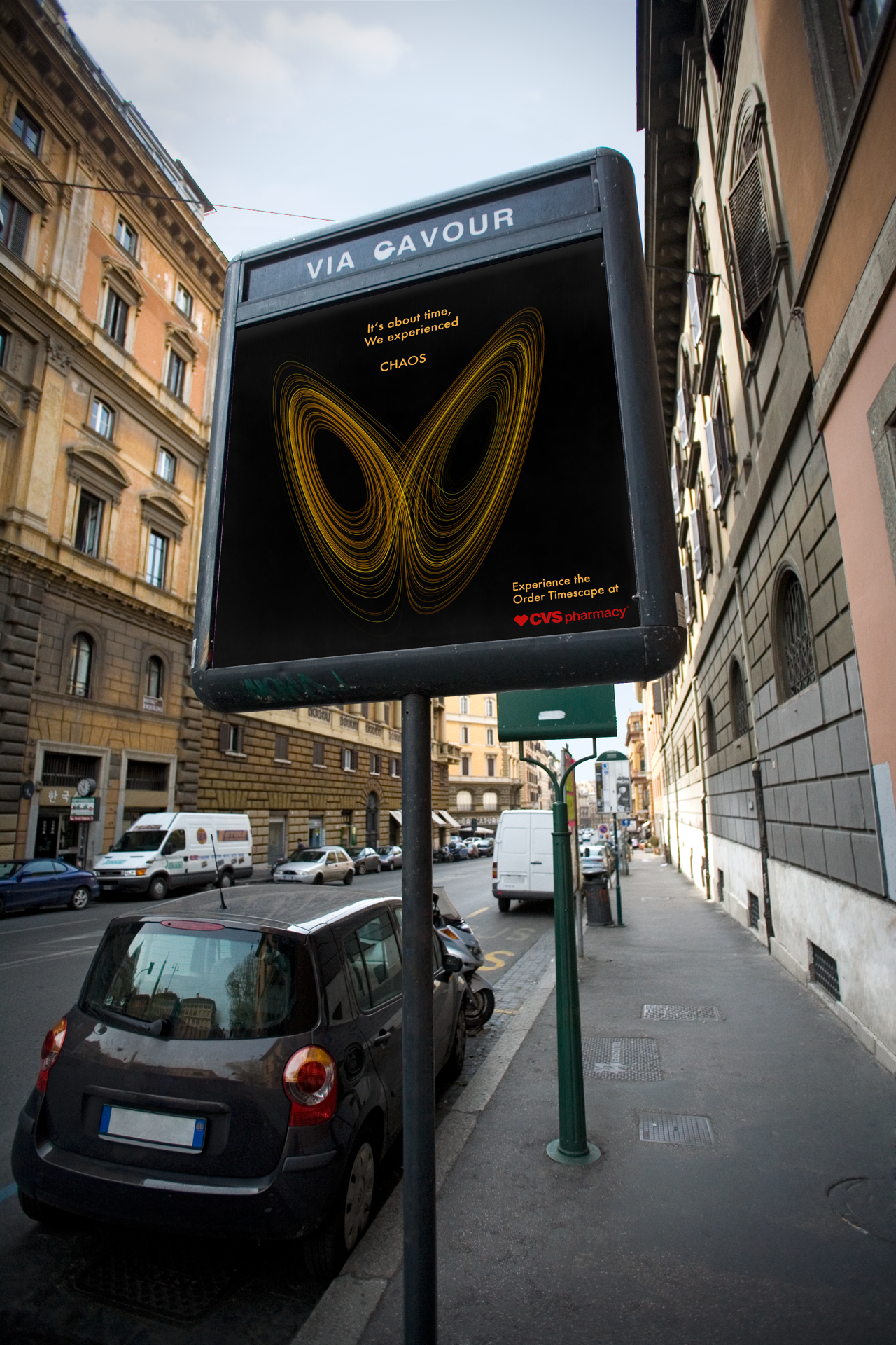
Timescape is a speculative neural hacking kit that aims to demonstrate that time is a construct of the brain. It consists of injectable proteins that temporarily alter the brain's neural plasticity, which changes various perceptions of time—like sequence, direction, change, and duration.
Timescape is intended as a bio-hack that users can obtain at the nearest pharmacy. Karan says the speculative product is intended to "provoke a conversation around the conflict between time as we experience it and the constructs of time like linearity, non-elasticity, and continuity that ‘clock time’ imposes. It challenges the status quo of time that is external and independent to time that is subjective and experiential." The Timescape kit consists of four shots, each of which is responsible for changing a specific perception. Each syringe consists of a protein formulation that modulates the synaptic stimuli responsible for mechanisms responsible for creating the respective construct in the brain.
Unwind
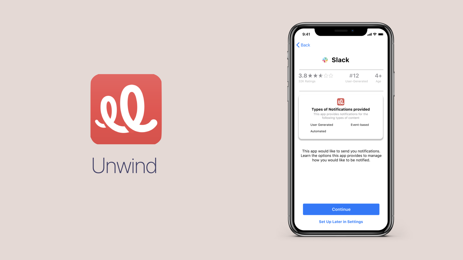
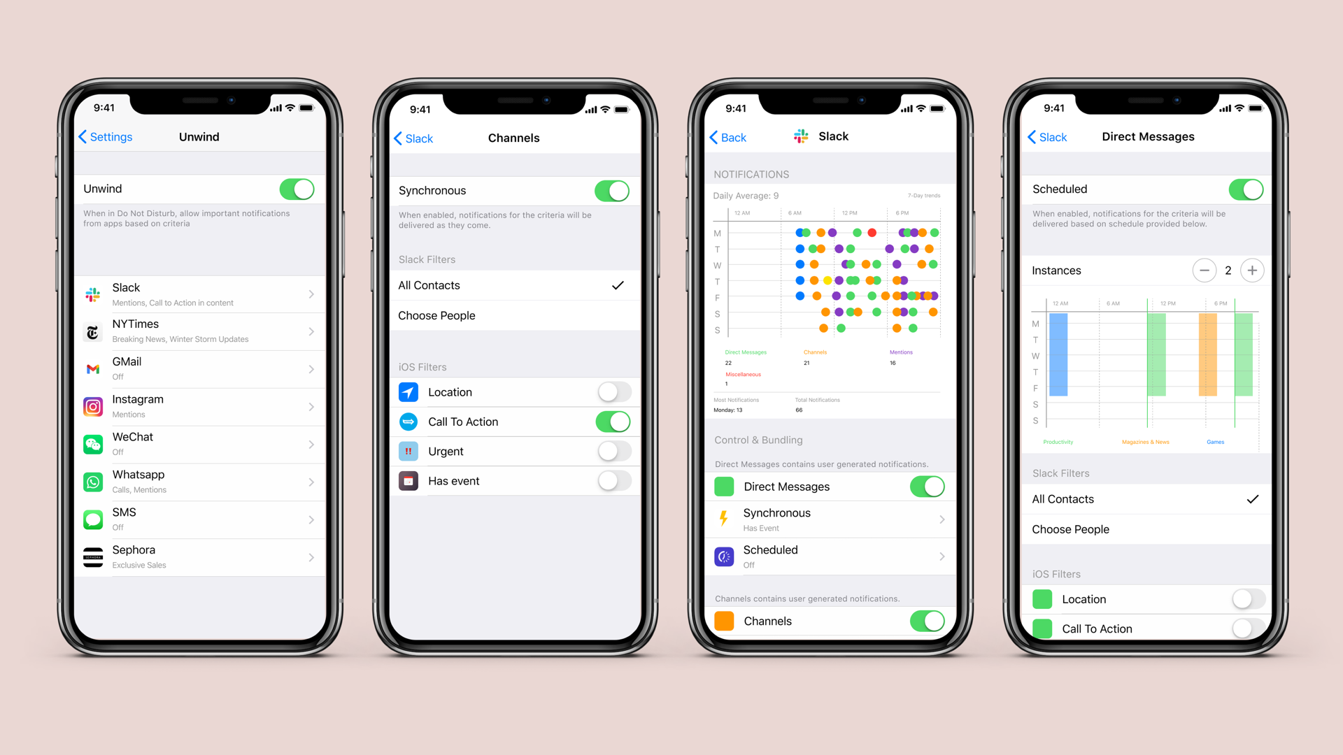
Unwind is a notification management tool built into iOS that helps users manage their attention overload, without fear of missing an important notification. It helps users understand and take control of how their phones interrupt them. It does so by allowing users to selectively filter notifications based on source and content, then delivering the notifications only in their desired context—for example, at a certain time, in a certain location, or when a user is performing a certain action. Unwind utilizes the Apple Push Notification Service and Artificial Intelligence to classify notifications, as well as a host of internet of things and third-party integrations to align the notifications in their desired context. Karan’s work explores how design might provide the individual greater control over their digital attention ecology in the Age of Information Economy.
When creating Unwind, Karan realized that current solutions to deal with interruptions from phones provided only an on/off control, forcing the user to choose between being interrupted frequently or potentially missing out on important communications by turning notifications off.
With Unwind, however, users can head to the new Unwind section of their phone settings to understand the various app-specific types of notifications. Users can also analyze how these notifications interrupt them and then take appropriate action by selecting various filters offered natively in-app and by iOS. To make things effortless, one could also simply ask Siri. For example, one could enable only New York Times Breaking News notifications while they’re working and schedule the rest of their New York Times notifications to arrive while they’re getting their morning coffee. After returning home from work, they could filter out all messages from their boss except those that contain a Call to Action.
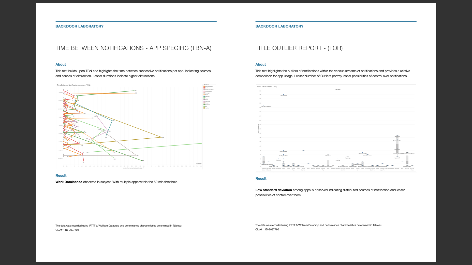
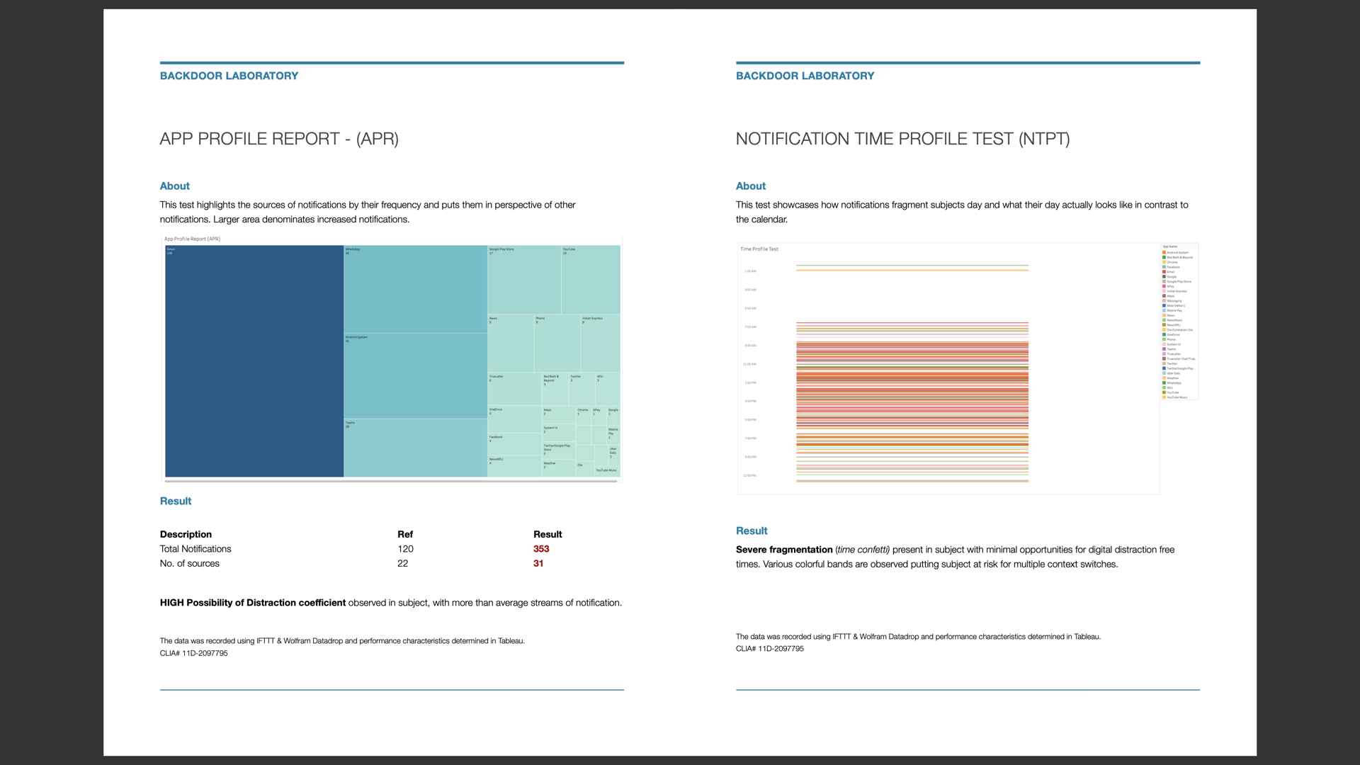
During the research phase of his thesis, Karan hosted an online experiment where he invited participants to set up notification trackers on their phones. Together they analyzed the distribution, content, and context of notifications, articulated problem needs, and brainstormed possible solutions.
Phaser
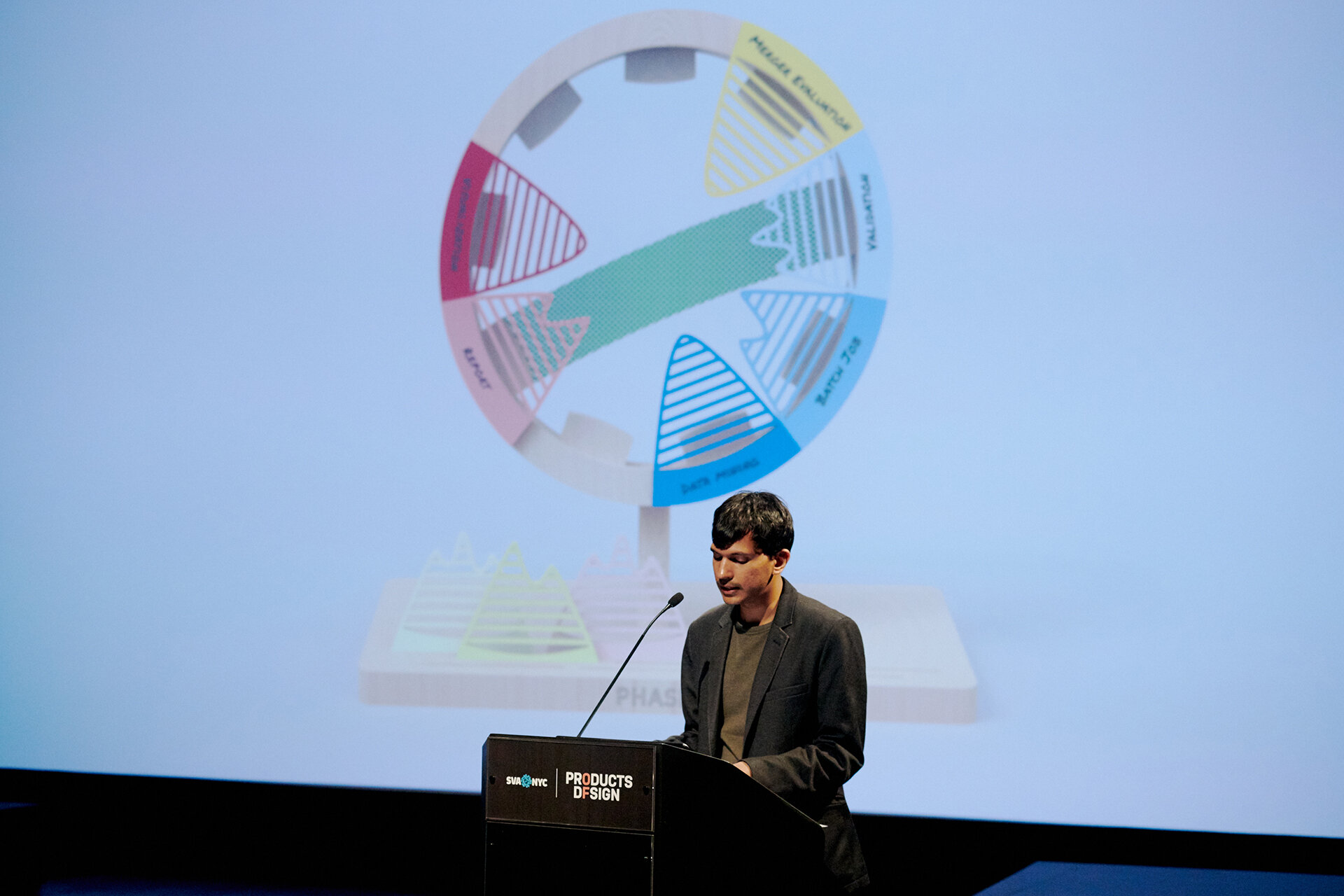
Phaser is a personal productivity system that helps knowledge workers visualize their work, transforming their conceptual and threatening workload into actionable, context-sensitive flow. It promotes subjectivity in task management by enabling the user to understand the value of their choices.
This project was envisioned to counter the increasing mechanization of the worker due to obsession with time management. Karan extrapolated what choice of how we spend our time in the office might look like in the deep future, by creating a newspaper article advertising a speculative neural synchronizer that would allow employees to directly synchronize their company’s calendar to their brain. Such a product posed the question: How different is “what calendar is to Man” from “what code is to machine”?
Upon talking to various subject matter experts in the field of Organizational Psychology, Karan learned that the obsession with time management takes away the agency of the worker. To prevent this, he was inspired to create a personal Kanban-style tool that allows users to approach choices and time more subjectively. Phaser helps the user in three ways:
Visualizing and materializing choices in tactile ways to make the user more aware of their choices
Representing connections between events to visually link the cause and effect between various choices
Visually demarcating priorities to help the user understand and adapt to changing priorities
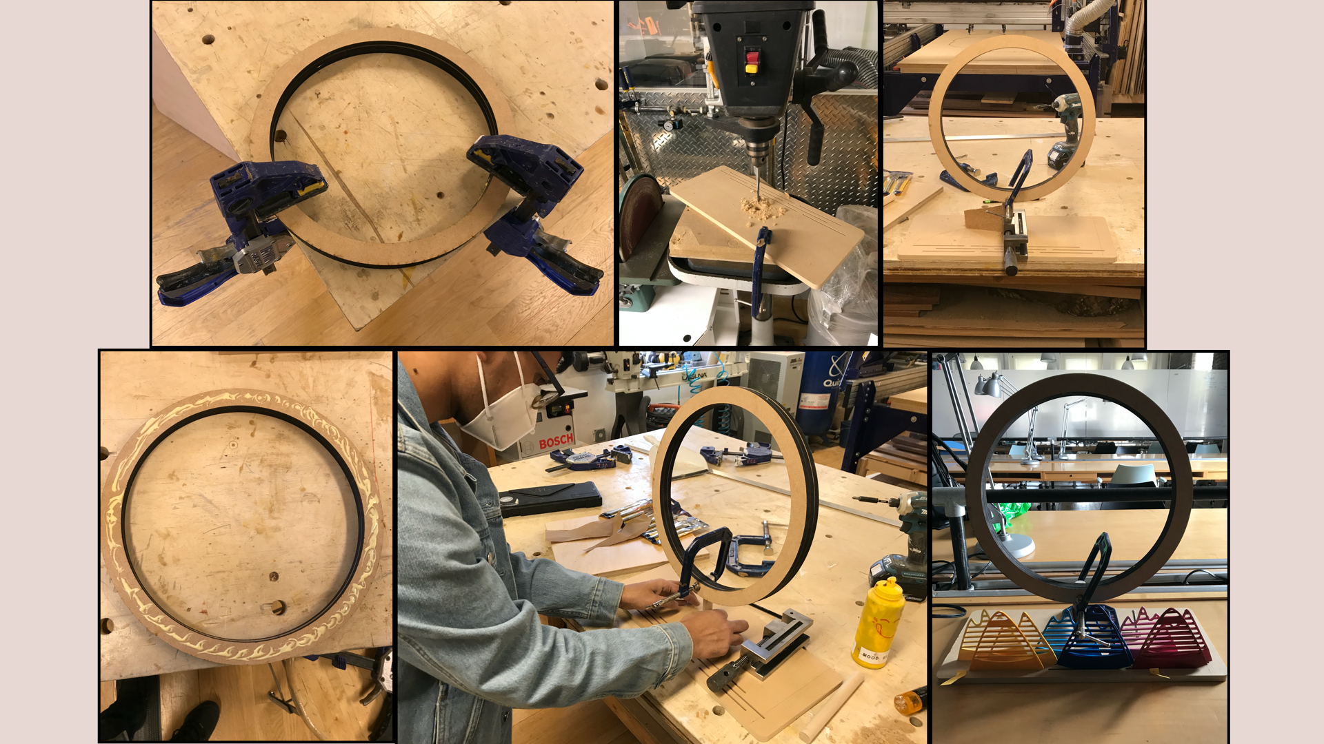
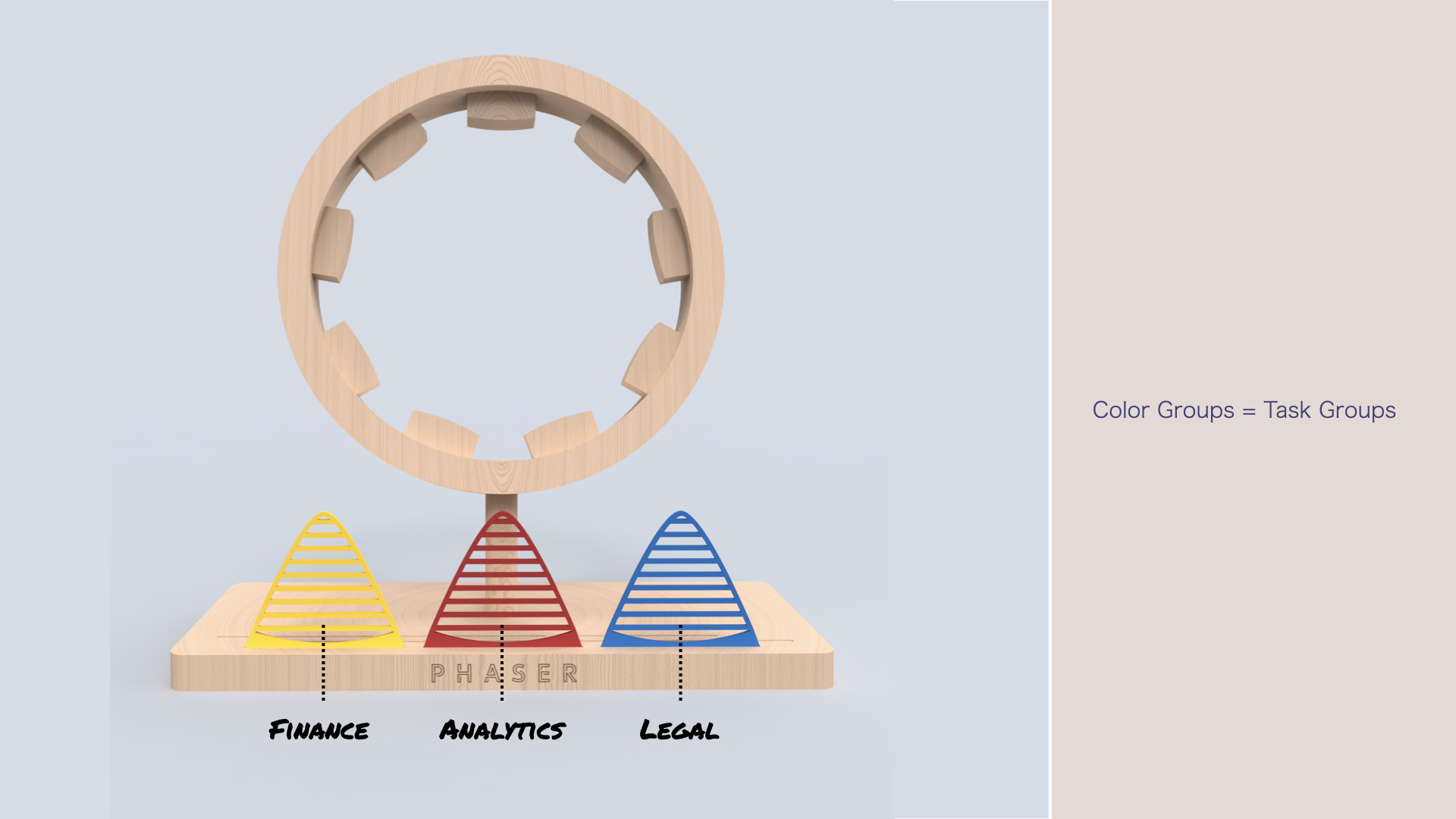
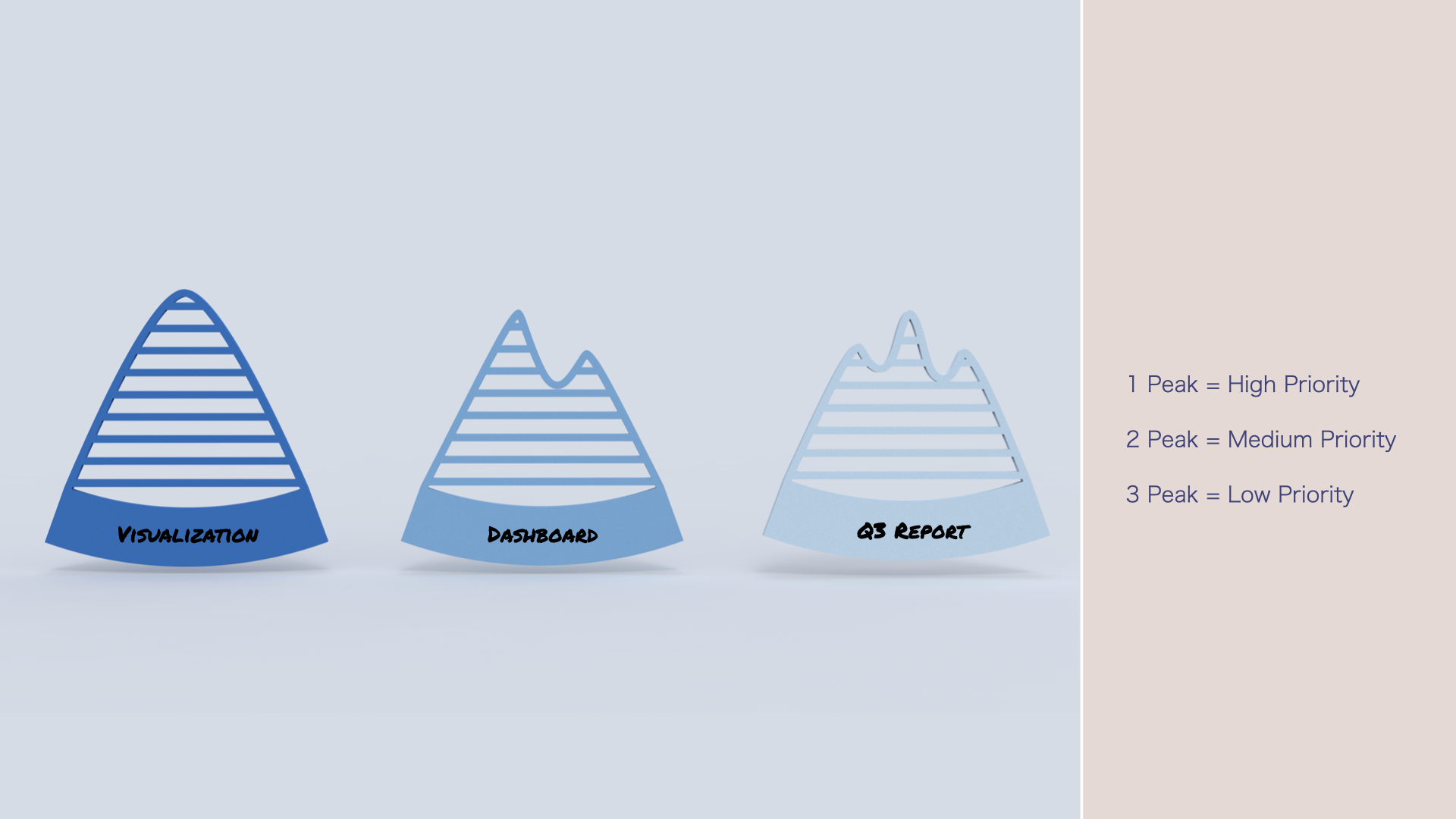
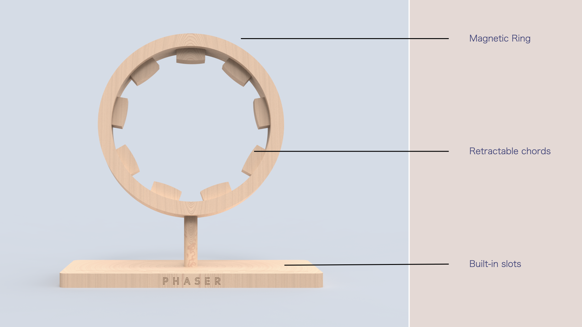
Phaser consists of colored sets of dry-erase writable surfaces, each color representing a different category of task. Potential categories include Finance, Analytics, and Legal, or Personal, Professional, and Social. Each category contains three distinct shapes, where the number of peaks denotes the distinct priorities of work. These tasks attach magnetically to the structure, and the retractable chords allow the user to have a visual representation of the flow of events. By giving users a self-initiated, tactile, and visual representation of their tasks, flows, and priorities, Phaser encourages them to be more subjective about their choices.
Hiatus
Hiatus is an iOS feature that helps define work-life boundaries for knowledge workers in the constantly connected and mobile workplace. It helps users maintain work-life balance by subverting productivity and injecting play into their otherwise work-oriented phones during non-work hours. The feature is intended to cultivate cultures of play in our personal lives, while containing the work cultures that moralize productivity and frame the narrative of how time is supposed to be spent.
Once enabled, Hiatus replaces the quantitative interfaces with ones geared toward qualitative fun, allowing the user opportunities to spend their time more subjectively. The user can configure their non-work hours in the settings and select the apps they want to switch. Once the non-work hour starts, Hiatus replaces the clock on the Lock Screen with fun, time-based activities they could do. On the Home screen, Hiatus hides the productivity apps within the App Library and replaces them with fun counterparts.
For example, Zoom is replaced with Houseparty, Mail is replaced with Yo, Stocks with Breathe, and Trello with Solitaire. Hiatus returns the interfaces back to normal at the start of the next workday.
Silly
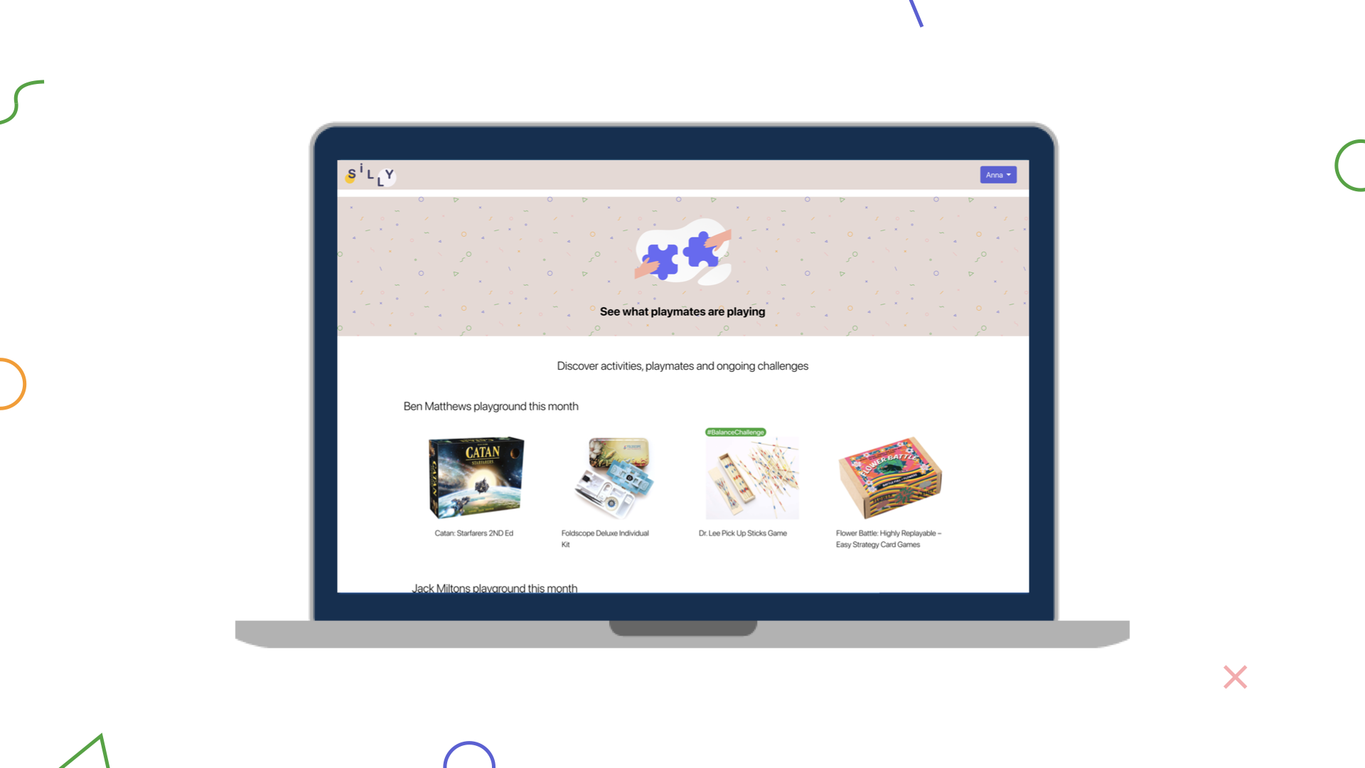
Silly is an employer-sponsored subscription box service created to cultivate a culture of active play amongst adults. It allows its subscribers to discover and subscribe to various play activities. It also facilitates engagement with fellow playmates by encouraging them to challenge each other, enabling them to make play a part of their daily routine. During childhood, play was our default state of being; Silly is envisioned to restore the act of play to that position. While exploring the state of choice in people’s personal lives, Karan found that the pandemic eroded the boundaries between work and home. As a result, people ended up working longer hours while working from home. His research indicated that even in the absence of a direct compulsion, people choose to do what they are told. While exploring ways to restore users’ choice, he identified the act of play as the ultimate expression of choice, for it is what one wants to do, not what one is obliged to do.
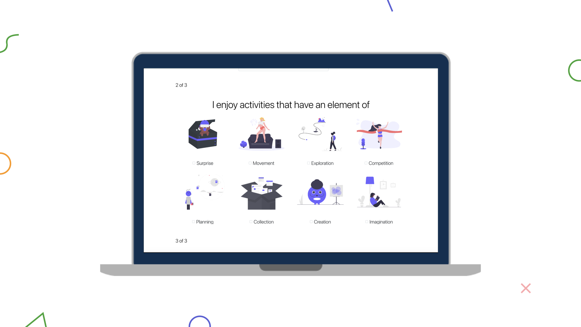
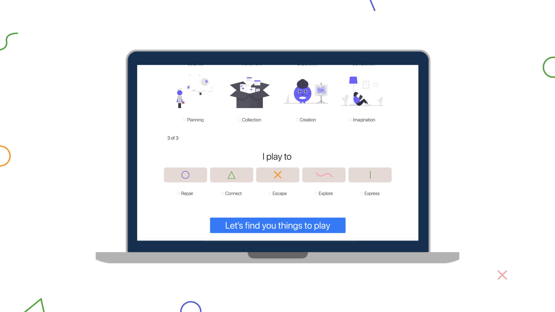
Users can discover activities by taking the short questionnaire on the website, answering questions about, for example, what types of play they enjoyed as kids, the multiple elements they enjoy within an activity, and their intention for play. Based on the answers, Silly determines a play personality and recommends activities users can subscribe to directly from the website.
To learn more about Karan Mahendra Bansal’s work, take a look at his projects in more detail at karanbansal.me.


