"Frubo" Fruit Bowl: A Case Study in Product, Brand, and Experience
Frubo is designed to live everywhere except the kitchen, with the intent of treating fruits the same way that we treat flowers: as pieces of beauty to be enjoyed at the height of their bloom.
Abstract
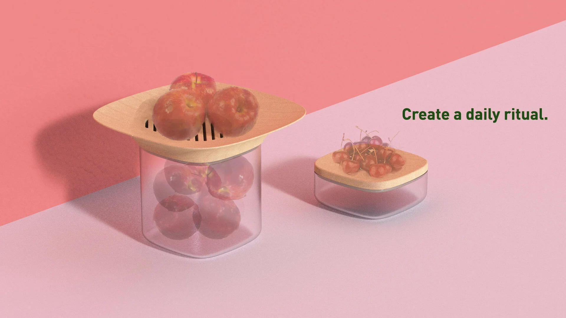
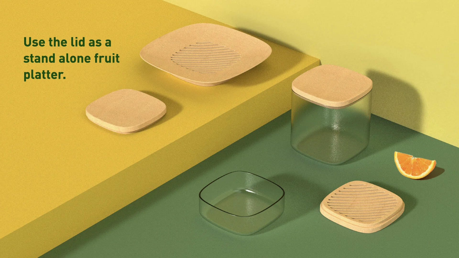
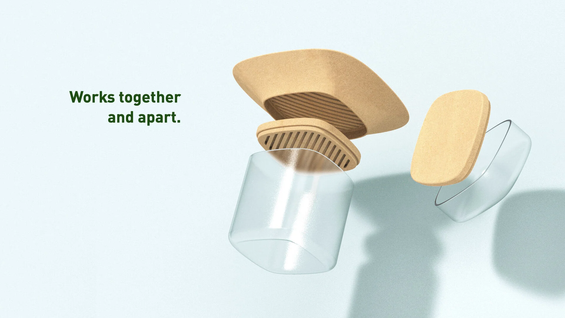
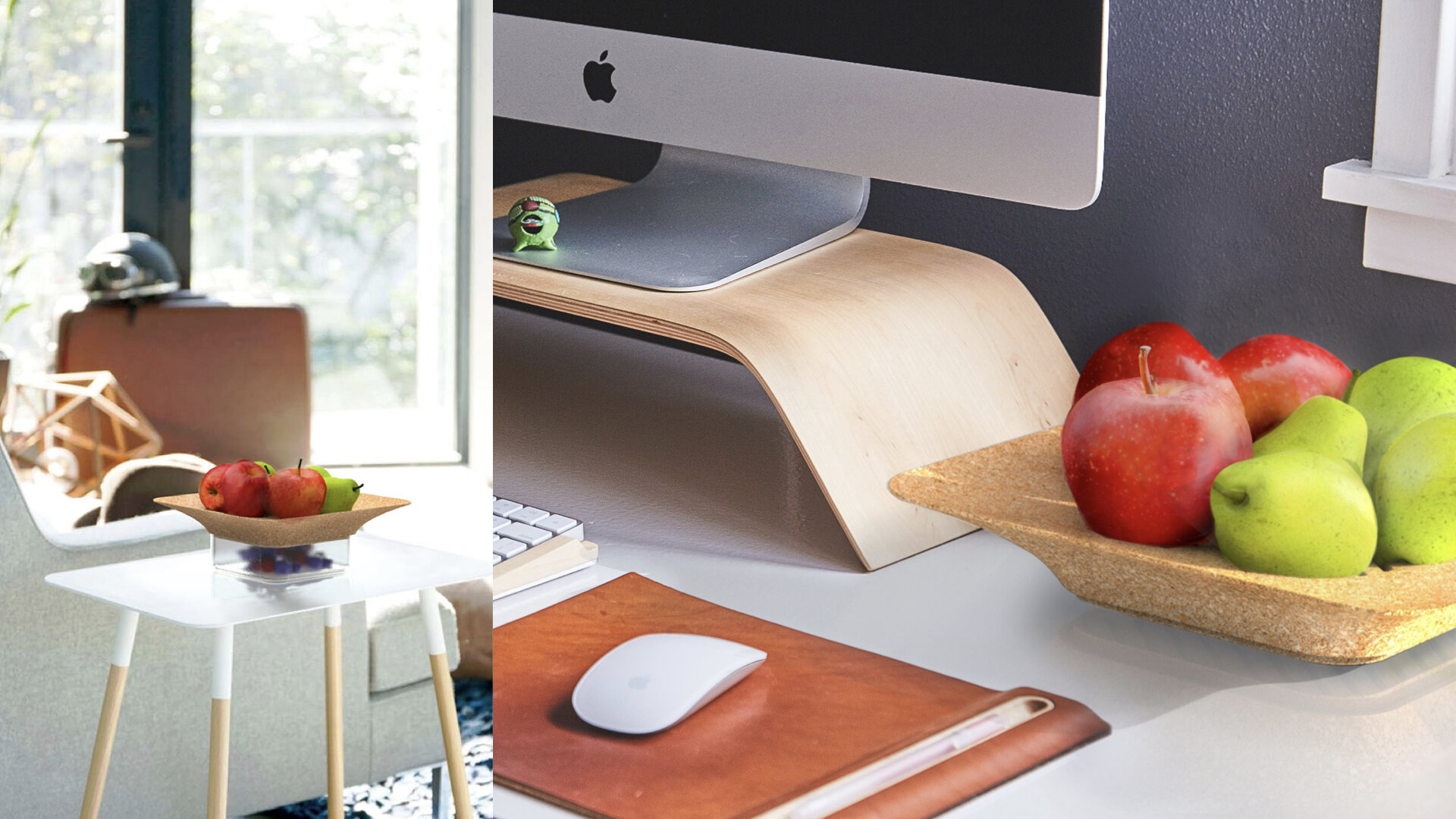
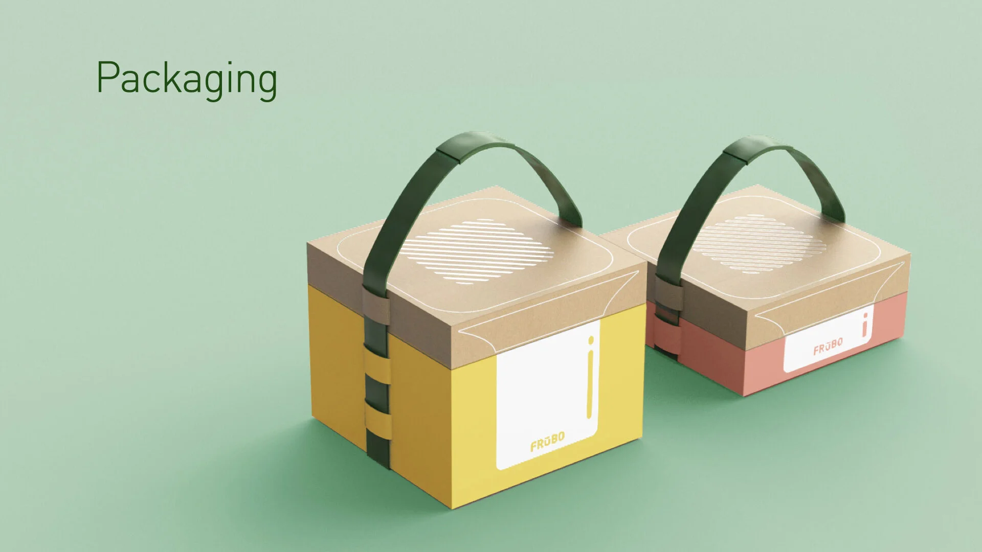
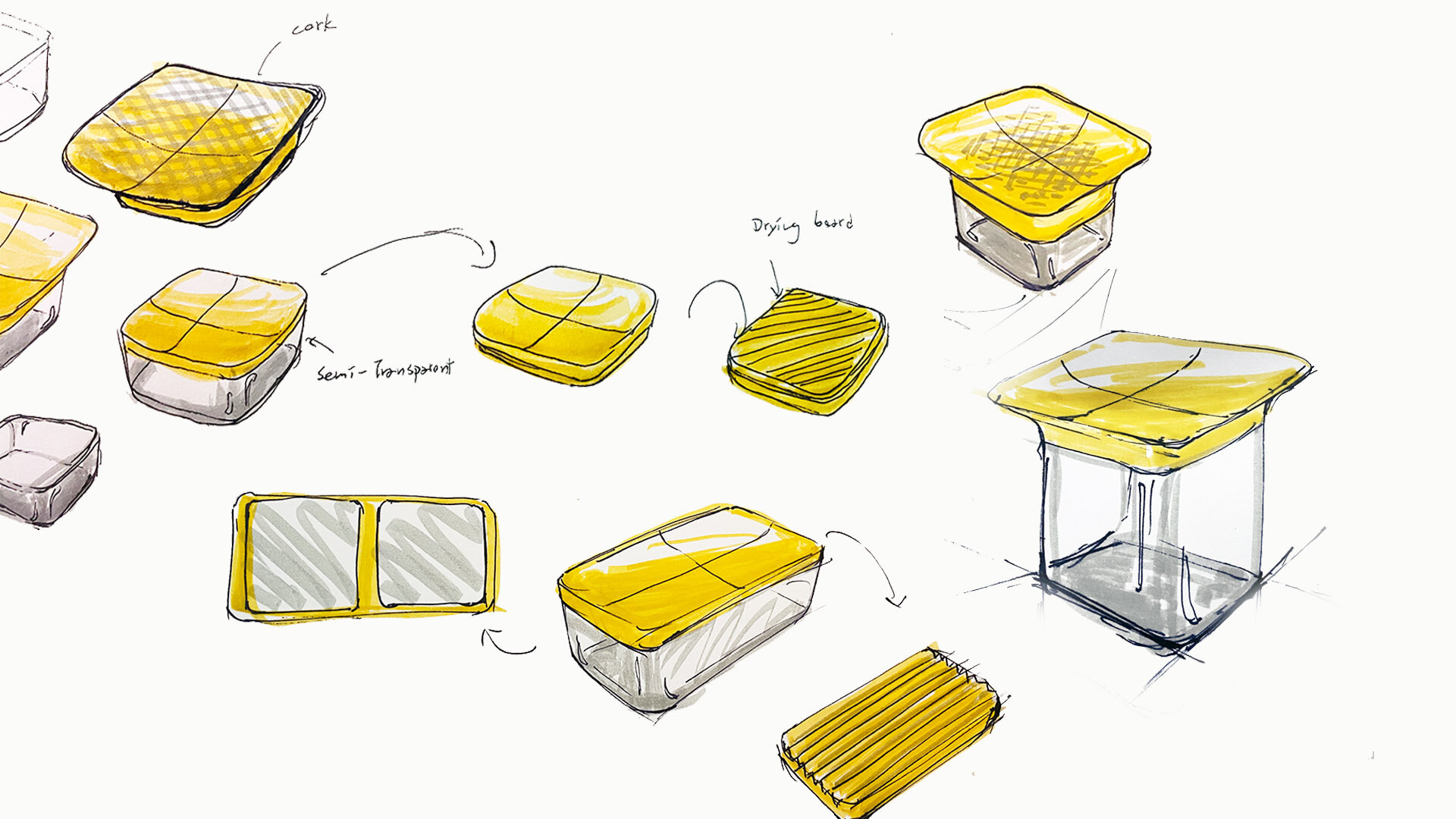
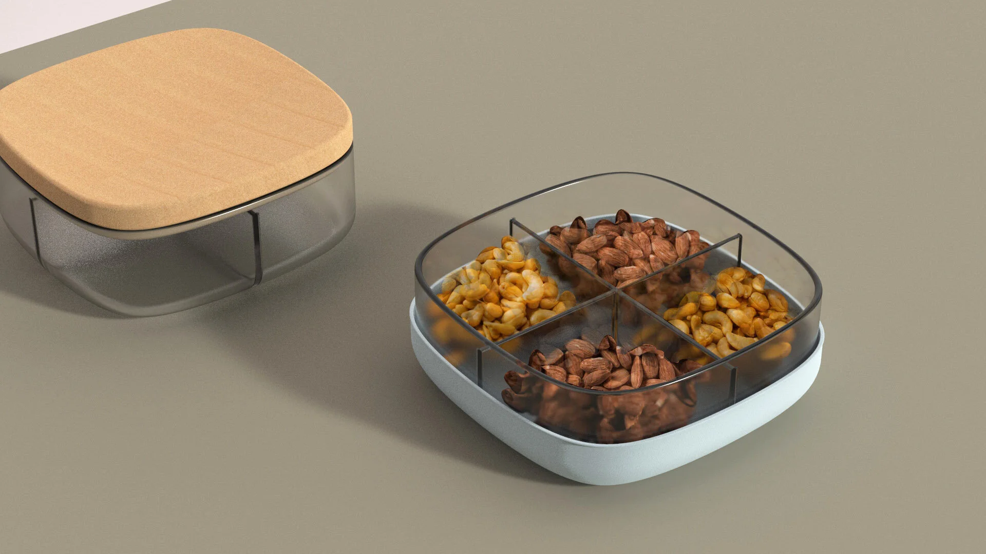
Frubo is a fruit bowl with a modern aesthetic and a hidden agenda. Masquerading as a simple piece of home decor to store fruits and vegetables, Frubo creates a space for the user to store fruits that they want to consume immediately on the upper platter, and fruits that they would save for another day in the bottom portion of the container. Frubo is designed to live everywhere except the kitchen, with the intent of treating fruits the same way that we treat flowers: as pieces of beauty to be enjoyed at the height of their bloom. “Place a Frubo in the office, living room, dining room, or any other spaces where people spend time, in order to allow the fragrance of ripe fruits to fill the space,” offer the designers.
The Design Brief
When second year students Regena Paloma Reyes and Felix Ho were asked to “redesign a product in ten weeks,” (the curriculum of the Product, Brand, and Experience course taught by Hlynur Atlasson), they immediately looked to products that they both used every day. The brief for the project was to identify products that are particularly wasteful—either due to scale or frequency of use—and to reimagine a way that different product or service could fulfill that need more intentionally, creating an ecosystem and lifecycle that is mindful of both the consumer experience and the environmental impact. Initially, Regena and Felix were interested in redesigning kitchen cabinet systems, bento boxes, coffee grinders, dog harnesses, and fruit bowls. However, Hlynur, challenged them to think more rigorously about the bigger picture: “Instead of focusing on a specific product,” he encouraged them, “look for larger trends in waste—following the biggest sources to identify opportunities and make a serious impact.” “We noticed that most of the products that we were both initially interested in redesigning were related to household food waste,” Regena reflects, “so we decided to follow that train of thought, and to dive into the current state of food waste—and particularly during the COVID-19 pandemic.”
Identifying the Opportunity
Curious about how global eating habits have changed as a result of the pandemic, Regena and Felix initiated their product research centered on one question: “How are people eating these days?” Starting with such a broad question and no geographical underpinning was at first uncomfortable, and beginning with such an outspread question for a ten-week project seemed to put the duo at a disadvantage—especially as other groups identified products that were perfect for an environmentally-meaningful redesign within the first week. Unfazed by ambiguity and the prospect of falling behind however, Regena and Felix dived into the research, identifying trends in shopping, cooking, and eating habits in in three countries: the United States, the United Kingdom, and Taiwan.
“American households throw away approximately one-third of the food they purchase yearly. Getting people to eat fruits at peak ripeness would indirectly target our goal of reducing the amount of fruit and vegetables that end up rotting in the refrigerator or on a counter.”
The secondary research paid off, as one trend overlapping across countries became apparent: “The pandemic had completely changed the locations where people eat—from outside the home to inside the home—and as a result, 43% of food loss in the United States was occurring in the home,” offers Felix. This key insight enabled Felix and Regena to formalize a design direction: Instead of focusing on redesigning a particular product, the designers decided that making an impact on household food loss would necessitate creating new behaviors—or manipulating existing ones—to indirectly address the causes of household food loss. With this direction in mind, Regena and Felix proceeded with convergent secondary research into how and why American households throw away approximately one-third of the food they purchase yearly.
Preliminary Ideation
As Regena and Felix delved deeper into the “why’s” and “how’s” of American household food waste, they began to sketch preliminary ideas for how to address root causes—many of which confirmed that behavioral intervention, rather than product intervention, would be the most effective way to reduce food waste. Identifying fruits and vegetables as the second and third largest categories of food wasted in the household, Felix and Regena iteratively ideated product-triggered behavioral interventions intended to help home cooks effectively store, visualize, and consume their fresh fruits and vegetables in a timely manner—preemptively rescuing them from the waste bin and, ultimately, the landfill.
“The pandemic had completely changed the locations where people eat—from outside the home to inside the home—and as a result, 43% of food loss in the United States was occurring in the home.”
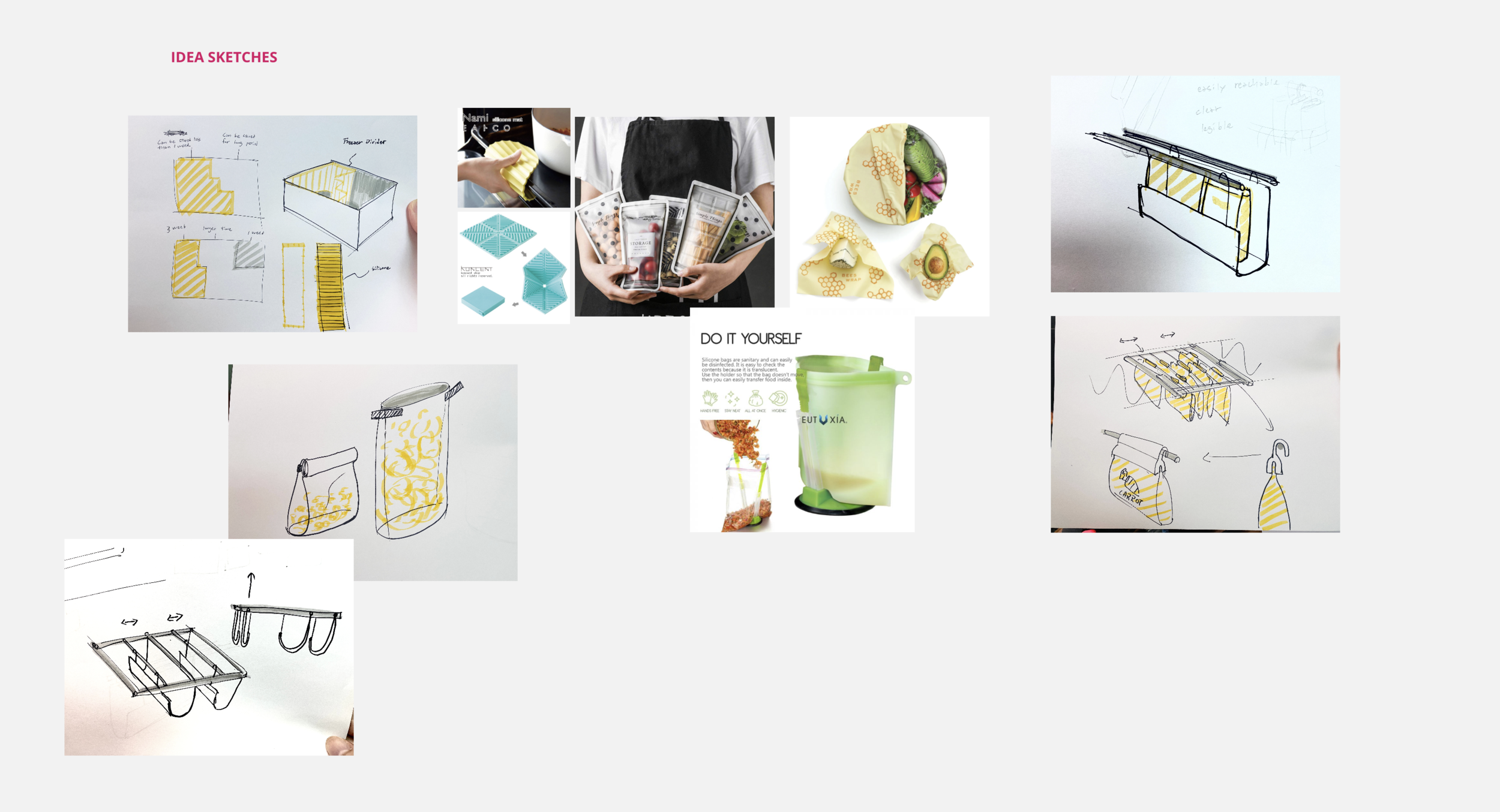
Initial ideas consisted of hanging pouches that would store fruits and vegetables in the refrigerator and freezer, as well as a refrigerator-to-counter system that simplifies weekly meal planning and prep. Regena and Felix also considered simpler solutions, such as a food calendar that would sit on the outside of the refrigerator and help households understand what exactly was in their refrigerator, and by what date they needed to consume each item. “Though these solutions would have made an environmental impact if the target audience regularly used them,” they argued, “there was no affordance in any of these products that would make someone want to use them.” These initial design interventions required a significant amount of will-power and discipline on the part of the consumer, and needed a moderate amount of maintenance that the duo could not rely on the customer to commit to. In short, they were neither fun nor beautiful and were purely utilitarian. Though their use would enable consumers to plan, store, and use their raw and cooked ingredients prior to spoilage, there was no trigger that would create the desire for the consumer to use them consistently. Here, Regena and Felix shifted their focus from solving the identified problem, to connecting with their consumers and developing an understanding of their needs, wants, expectations, and stereotypes as they pertain to household waste of fruits and vegetables.
Strategy Refinements
Shifting the design focus from problem solving to experience crafting, Regena and Felix performed a competitive analysis of brands that have successfully created emotional bonds in people’s hearts. Since their goal was to create more sustainable fruit and vegetable consumption habits for people spending more time in their homes, Felix and Regena decided that learning from popular lifestyle brands would give them an idea of how to create a sense of excitement and fulfillment in their product experience. “We wanted to make it pleasurable for consumers to build a new habit,” they offered. The duo looked at brands like Daily Harvest, a fruit smoothie company that ships fresh fruits for blending to consumers to promote healthier snacking, and Lululemon, an athletic wear company loved by many for their comfortable clothing. Regena also followed up with researching behavioral science approaches to creating and manipulating habits, looking to Charles Duhigg’s book, The Power of Habit: Why We Do What We Do in Life and Business, and extracting his insights on habit loops and how they work.
“The goal was to sell people on ‘fruits’—not ‘Frubo.’ The product only exists to serve as a pedestal for fruits, which can often be overlooked when placed in typical fruit bowls.”
Coupling this understanding of how brands create delight in their consumer evangelists with strategies for creating and sticking to habits and routines, Regena and Felix moved toward specifying their target audience. Who did they want to reach, and what could they learn about those people that would help them want to use any design intervention they created? With these questions in mind and following the guidance of Hlynur, Regena and Felix came to a pivotal moment in their brand and experience design where they opted to focus on the joy of consuming ripe juicy fruits, and to build an experience around the sweetness of a truly ripe fruit. “We wanted to focus on the target audience: busy individuals and families desiring simpler ways to incorporate raw fruits and vegetables into their diet. Getting people to eat fruits at peak ripeness,” they argued, “would indirectly target our goal of reducing the amount of fruit and vegetables that end up rotting in the refrigerator or on a counter. Telling consumers to eat their fruits before they spoil is neither fun nor appetizing. Persuading consumers to eat fruits by emphasizing the deliciousness and joy of ‘catching a fruit at its sweetest and juiciest’ is much easier, more appealing, and still addresses the food waste goal without directing the consumers’ attention to it.”
Produce, Brand, and Experience Integration
Opting for this surreptitious, yet enticing experience strategy grounded in behavioral science, Regena and Felix moved forward with product and branding refinements. They had developed product ideas that would reduce food waste, identified an experience goal to create excitement, and understood how to implement a habit loop to increase product stickiness. Synthesizing these three elements, they created Frubo, a lifestyle brand committed to sharing the passion for ripe, juicy fruits with the world. The name, Frubo, is a portmanteau word of “fruit” and “bowl” that has a catchy ring and summarily captures the essence of the product itself. Here’s the pitch once again now that you know the backstory:
Frubo is a fruit bowl with a modern aesthetic and a hidden agenda. Masquerading as a simple piece of decor to store fruits and vegetables, Frubo creates a space for the user to store fruits that they want to consume immediate on the upper platter, and fruits that they would save for another day in the bottom portion of the container. Frubo is designed to live everywhere except the kitchen, with the intent of treating fruits the same way that we treat flowers, as pieces of beauty to be enjoyed at the height of their bloom. Place a Frubo in the office, living room, dining room, or any other spaces where people spend time, to allow the fragrance of ripe fruits to fill the space.
This sugar high boosts the mood slightly by triggering a short-term release of dopamine, while stimulating tryptophan transport to the brain. The immediate result is a subtly-addictive sense of pleasure, that is just enough to serve as a reward to the olfactory and visual cues.
Frubo’s habit loop is predicated on olfactory and visual cues, where the consumer sees and smells the sugary sweetness of the fruit in the room and begins to crave them subconsciously. Giving in to the allure of the fruit itself, the consumer finds themself chomping away at the fruits and enjoying a dose of natural energy and a gentle sugar high. This sugar high boosts the mood slightly—not in a manner that would be noticeable to the person, but just enough to perk of the brain’s pleasure center (the nucleus accumbens) by triggering a short-term release of dopamine, while stimulating tryptophan transport to the brain. The immediate result is a subtly-addictive sense of pleasure, that is just enough to serve as a reward to the olfactory and visual cues. The brain remembers this pattern—associating the sight and smell of a delicious fruit with the action of eating that fruit—and the reward is a tiny boost to the pleasure center. Repeating this loop reinforces the mental connection between the cue, action, and reward, making it increasingly likely that the consumer, upon seeing a ripe fruit, will eat it. (Of course, nature evolved us for this behavior, but our increasingly-indoors and alienated urban lives have broken this obvious connection.) Over the long term, Frubo trains people, via habit loop, to eat the fruits they have before they spoil, ideally when they are at their ripest! Every fruit consumed in its prime is one fewer fruit that finds itself in the landfill. In this way Frubo achieves its goal of reducing household food waste of fruits and vegetables, while creating a pleasurable experience for the humans involved!
Branding
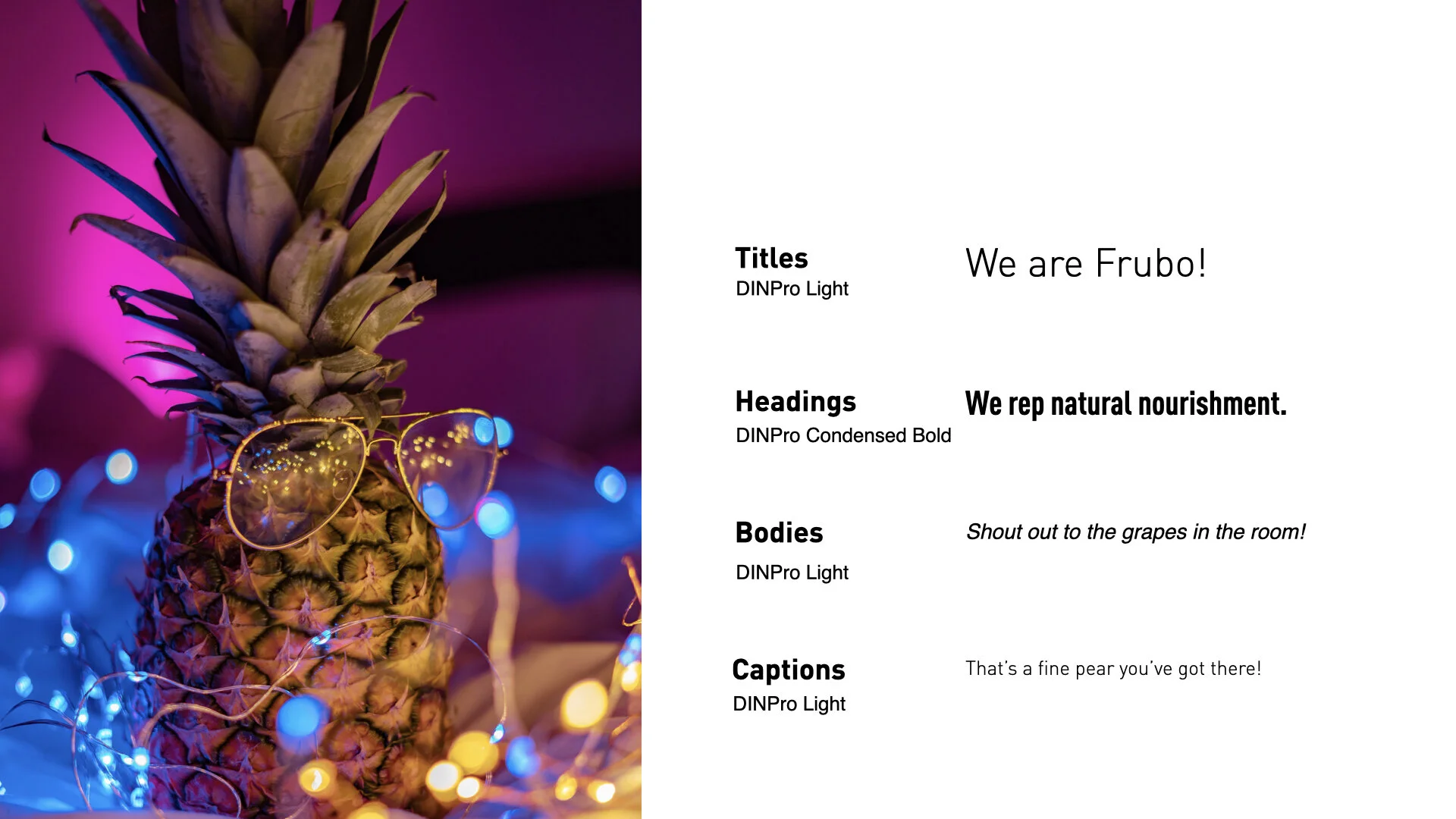
Photo: Pineapple Supply Company from Pexels
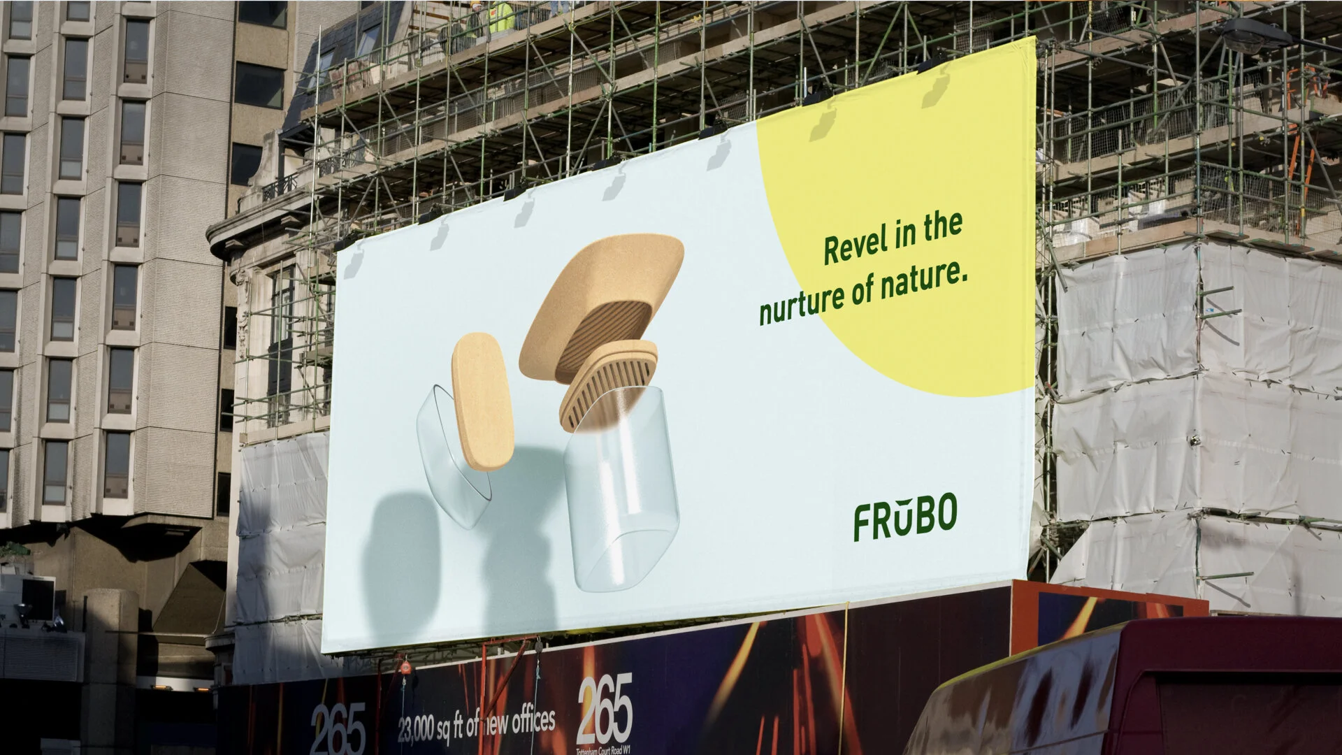
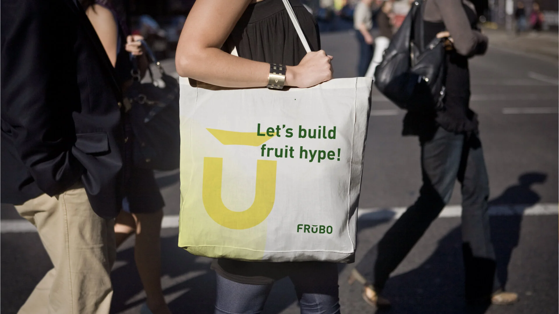
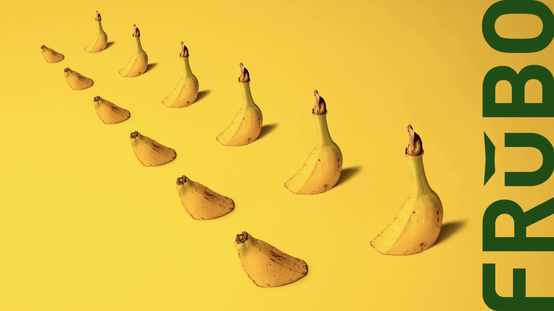
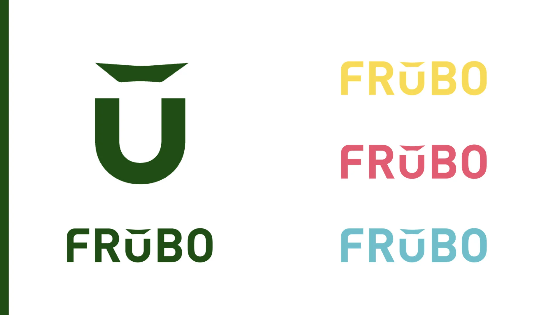
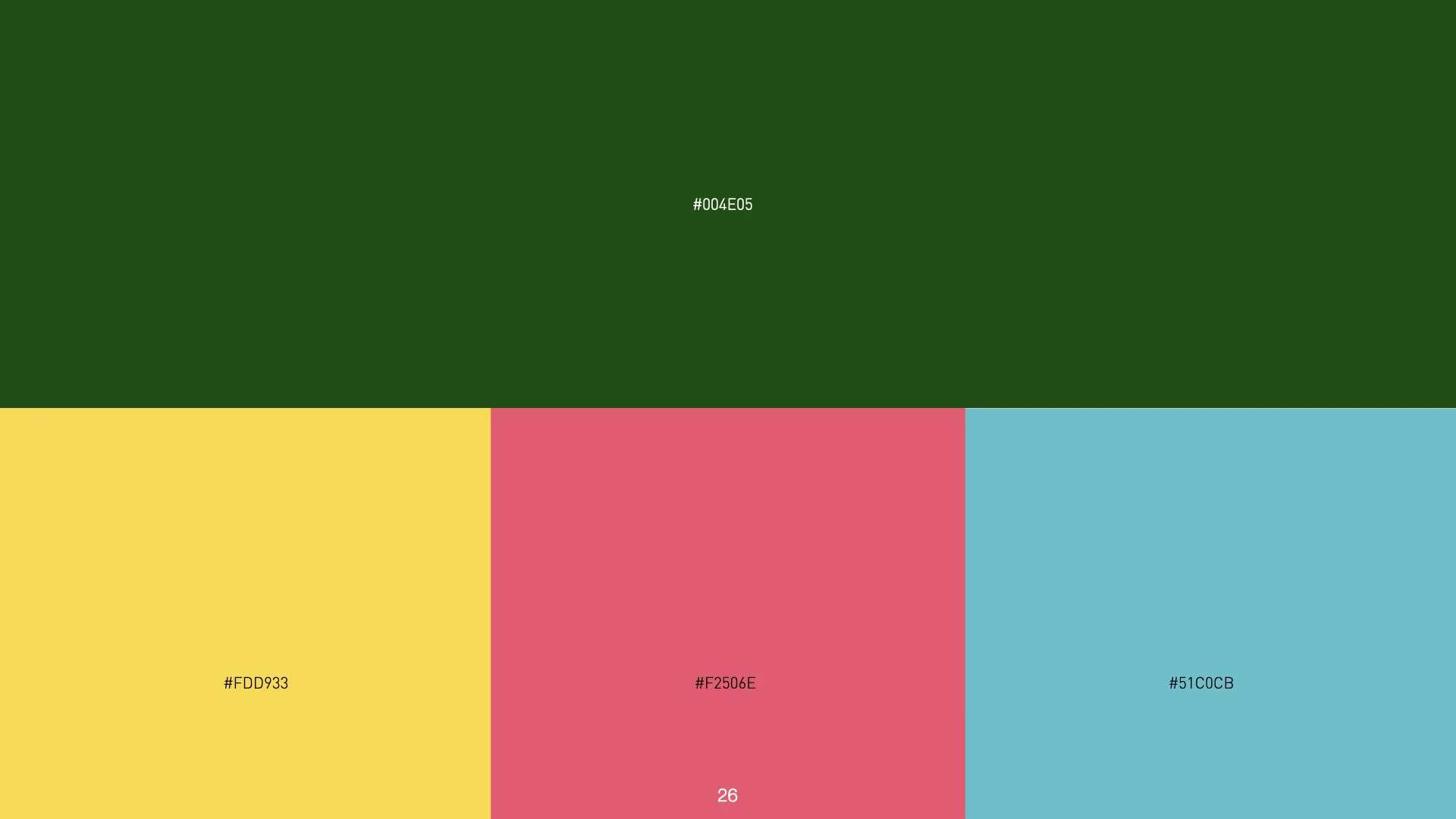
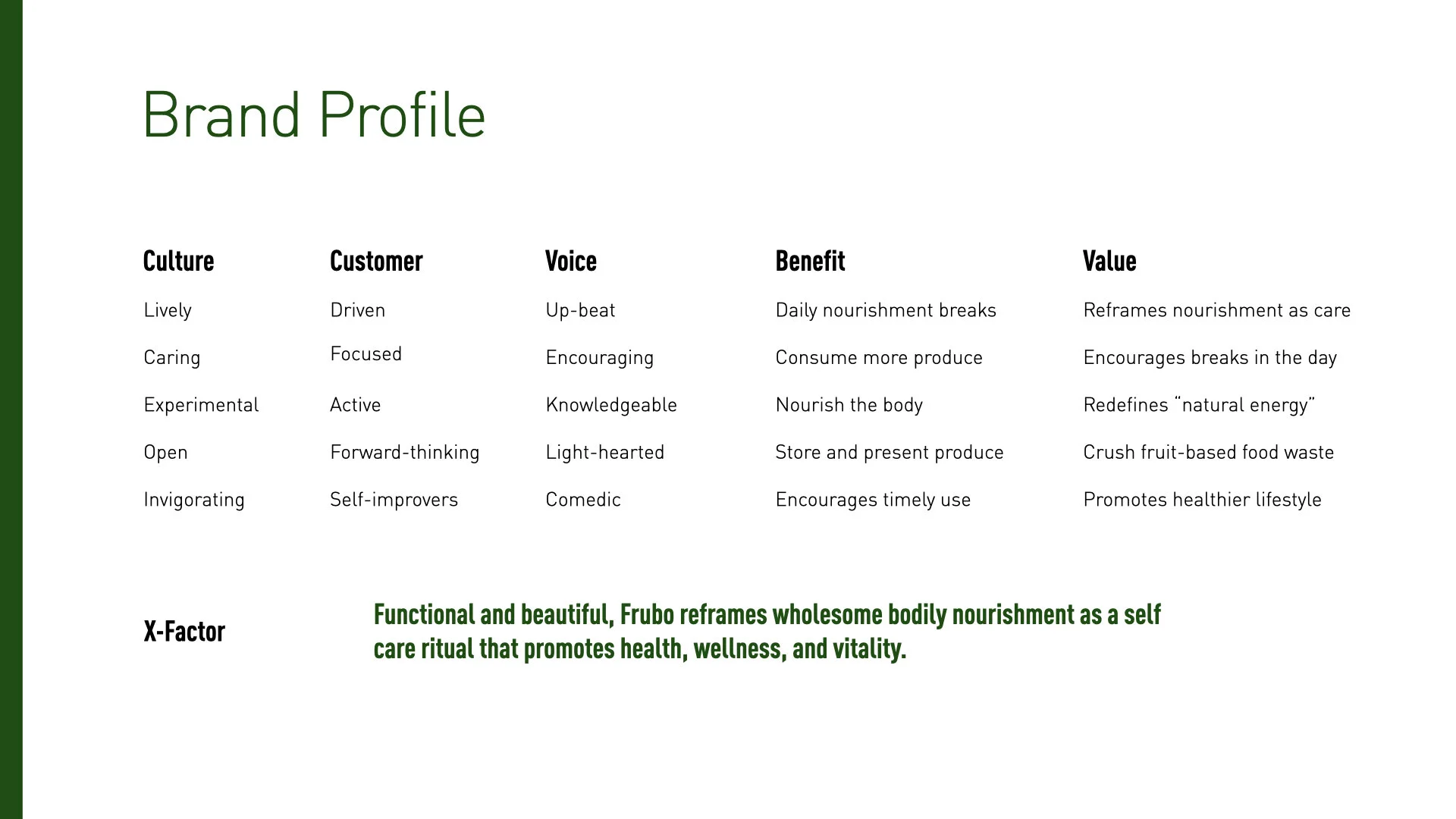
Frubo branding is designed to heighten the excitement of eating the fruits, in order to help consumers to feel the same joy and delight that Regena and Felix felt when they eat their own fruits. While the duo got many ideas for branding from other lifestyle brands, they opted to create their own voice that is playful, uplifting, and with a sense of humor. “Saving fruits from the landfill can be a very boring conversation,” they remarked, “so we wanted every conversation involving Frubo to be exciting, cheeky, and as colorful as fruits themselves.” To achieve this goal, Felix first created the Frubo logo—designed to create a visual associated between the product and its name, while Regena developed a verbal identity, color palette, and imagery guide that reflected all of the fun and puns involving fruits. Blending the branding with the product, Regena weaved a brand narrative where fruits became the highlight of the story, not the Frubo. Her goal was to sell people on Fruits, not Frubo, with the perspective that Frubo only exists to serve as a pedestal for fruits, which can often be overlooked when placed in typical fruit bowls. For Regena and Felix, fruits are the stars of show. Frubo exists to present them in a different way and in different spaces to help others find enjoyment in them too.

